Design for every screen size
People will open your app on a small phone, a big tablet and a wide browser window. Instead of designing each size separately, you build one layout that stretches and flows to fit, then check it at other sizes without leaving the board.
Nowa has no breakpoints
Some design tools use breakpoints: widths at which a screen swaps to a different layout. Nowa has no breakpoints, no setting for separate phone and tablet layouts, and no per-device options in Details. Each screen has one layout, and you make that layout flexible. When you really need a different arrangement on wide screens, you can switch widgets by width yourself.
Make a layout that adapts
A layout adapts when each part knows how to react to more or less space. A sign-up form, for example, looks right on any phone when its fields stretch to the full width while the logo keeps its size. Lay out widgets explains the tools.
| You want | Do this |
|---|---|
| A widget to fill the width | In a Column, set its W to Expand. In a Stack, use Left and right constraints. |
| Widgets to share a row | In a Row, set W to Expand on each to split the space equally. A Fixed or Auto widget keeps its size and the others share the rest. |
| A widget to keep its size | Set W and H to Fixed. In a Stack, pin it to an edge or choose Center. |
| A widget to fit its content | Set W or H to Auto, offered when the widget has a natural size, such as a text or an icon. |
| Space between widgets to grow | In a Row or Column, set Spacing to Between, Around or Evenly. |
| Widgets to continue on a new line | Use a Wrap widget. |
| More columns on wider screens | In a Grid View, choose Max. It fits as many columns as it can without a tile getting wider than Max Cross Axis Extent. |
| Tall content to scroll | Add the Scroll View wrapper, or use a List View. |
Try it: make a screen stretch
This takes a minute and shows the idea in action.
On the starter app's home screen, step 1 can turn the screen gray and show a "Canvas error" in the status bar. You can still make widgets stretch without changing the group: keep the Stack, select each widget and choose Left and right in its constraints under Layout (see Place widgets in a stack). Then do step 3.
- Click the screen's title. In Details, find the Group section and click the down arrow. The screen's main group becomes a Column, with your widgets in the same order and the space between them kept as the Gap.
- Select a text field, a card or a button. Under Layout, set W to Expand so it fills the width. Repeat for other widgets that should stretch, and leave small things, such as icons, alone.
- Click the screen's title and set Size to 1920x1080, then to a phone preset such as iPhone 12. The stretched widgets follow the width of the screen, while the rest keep their size.
Check your layout at other sizes
On the board. Click a screen's title and find Size in the Screen section of Details.
| Preset | Size |
|---|---|
| Pixel 3a | 393 × 808 |
| iPhone 11 Pro | 375 × 812 |
| Galaxy S20+ | 384 × 854 |
| iPhone 12 | 390 × 844 |
| MacBook Pro | 1155 × 807 |
| 1920x1080 | 1920 × 1080 |
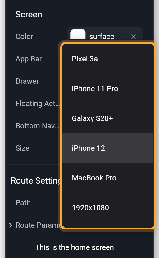
A new screen starts at 393 × 808 unless its template sets another size. For any other size, drag a corner of the screen or type W and H under Layout, and swap them to try landscape. Don't worry about picking the "right" size: Size only changes how big the screen looks on the board, and your app fills whatever device it runs on. On the board, a screen is clipped to its frame, so anything that overflows it is cut off instead of painting over the items around it.
To compare two sizes at once, select the screen's title, press Ctrl/Cmd + C, point at empty board space and press Ctrl/Cmd + V. Give the copy another Size. Both items show the same screen, so every edit appears in both. In the web app, your browser may ask to see your clipboard the first time you paste: allow it, or nothing is pasted.
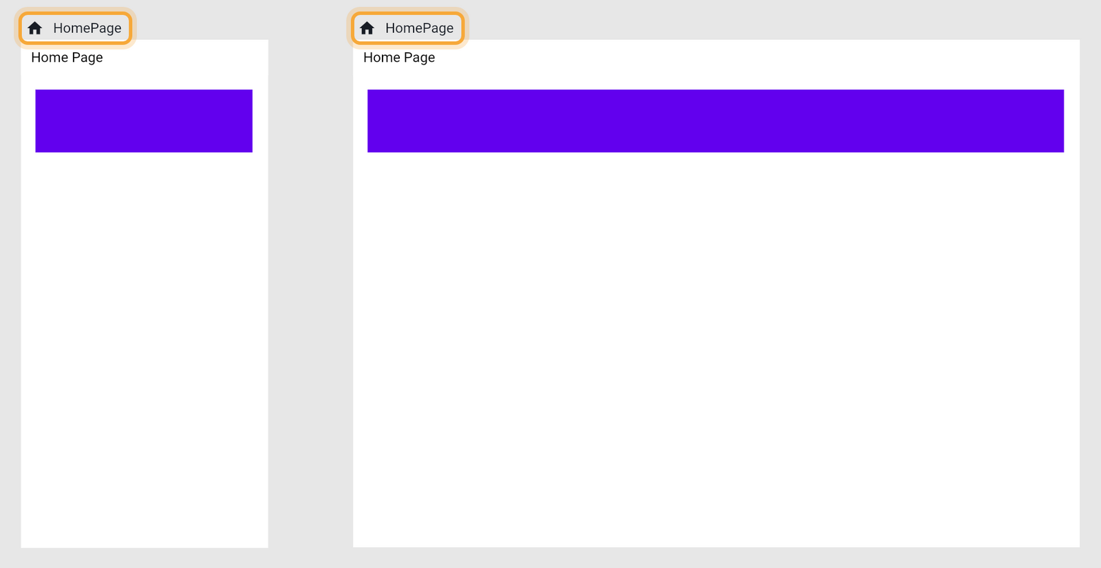
Hover a screen's title and click Play to tap and scroll at its current size. See Play your app on the board.
In a device frame. In a cloud project, play a screen, click Share preview, then the Open in browser icon. On a computer, the preview page has a toolbar. Click Device Settings to open Play Settings.
- Device Size: pick a device by platform, listed with its size. The Custom tab takes a Width, Height and Pixel ratio.
- Free Size: drops the frame, so the app fills the window. Resize the window to watch the layout react.
- Orientation: rotates devices that can rotate.
Full Screen in the same toolbar opens a bigger view with a Device panel. See Share your app.
In the real app. Run shows your compiled app in a phone frame. Phone / Tablet switches frames and Fullscreen drops the frame. See Run your app and Run on a device or emulator.
Design with realistic content
On the board, Nowa fills in values that are still empty, such as a list your app only fills once it runs, so a design doesn't look blank. Real content is usually longer, so test with it too: a product name that runs to two lines, or a list of 30 orders instead of three.
| Empty value | What the board shows |
|---|---|
| Text | The name of the variable or param, in square brackets, such as [title] |
| List | Three sample items |
| Image | A stand-in picture, 48 × 48 pixels when the image sets no size |
| Color | Gray. A color that may be empty stays empty, so the widget's own default shows |
| Icon | An info icon |
| Widget | A small 48-pixel placeholder box |
To see your own content, give the variable (a value the screen remembers) or param (a value passed in from outside) a Default Value. The board shows it as a real value. See Store data in variables and Pass data with parameters.
If a Column, Row or Stack repeats a widget for each item of a list, such as one card per recipe, the end of its Group section has a Test button named after the item type, such as Test String for a list of texts. Set how many Copies to show and a sample value to preview a long list or long names. Edit Test and Clear appear afterwards. The test changes only the board, never your app.
Play uses your app's real values instead of placeholders. See Placeholders on the board, real values in Play.
Show different widgets on wide and narrow screens
A screen can read its own width, and the Visibility wrapper shows or hides a widget, so together they can switch what shows by width. A common example: a side menu on tablets and computers, and a bottom bar on phones. On the board and in Play, a screen's width is the width of its board item, so changing Size is a quick way to test.
The easiest way is to ask Nowa AI in Agent mode, for example: "Show a side menu when the screen is at least 600 pixels wide, and a bottom bar when it's narrower." Then change the screen's Size and click Play at each size to check that the right version shows.
To set it up yourself:
- Build both versions, for example the side menu and the bottom bar.
- Select the wide version, click Add Wrapper and choose Visibility.
- In the Visibility section, click the Visible label, open EXPRESSIONS and choose Logical. A popup opens.
- Set Type to
double(a decimal number) first, because changing it resets both sides. Then set Operator togreaterThanOrEqual(is at least). - Click the Left side label, open GLOBALS and click Media Query, which knows the screen's size. In the list that follows, pick
size, thenwidth. - Type
600in Right side, or the width where your layout should change. - Select the narrow version and set it up the same way, with the operator
smallerThan(is less than). - Change the screen's Size, then click Play to see which version shows.
Comfortable typing a formula? In step 3, choose Custom Expression... instead, type MediaQuery.of(context).size.width >= 600 for the wide version, or MediaQuery.of(context).size.width < 600 for the narrow one, and press Enter. See Write your own expression. For more on Media Query, see Read the screen size.
Try "Make this screen work on phones and tablets: stretch the fields to the full width and put the cards in a grid that adds columns on wider screens." Then check the result at other sizes. See Write prompts that work.
Next steps
- Lay out widgets: rows, columns, stacks and sizing in detail.
- Play your app on the board: tap through a screen at any size.
- Make screen responsive: an older walkthrough made with an earlier version of Nowa.