Create and edit themes
A theme is your app's style guide: its colors, its text styles and the look of its buttons and text fields, all in one place. Change a color once in the Themes panel and every widget that uses it follows, right there on the board. Rebranding becomes one edit instead of a hunt through every screen.
It pays to set your theme early, before you design many screens. Set the theme first explains why.
Open the Themes panel
- Click Themes in the left sidebar, or press Ctrl/Cmd + 3. The theme your app uses opens for editing, with Colors, Typography and Widgets below it.
- To see all your themes, click the arrow next to the theme's name.
New projects start with two themes: lightTheme for a light look and darkTheme for a dark one. The board shows your app in the Active one, so you see every edit as you make it.
If the board doesn't seem to show a change, click Refresh to redraw your app with the current theme. While the panel has focus, Ctrl/Cmd + Z and Ctrl/Cmd + Y undo and redo your theme edits.
Open in New Tab opens your themes as code. Working in the code? See What Nowa adds to your code.
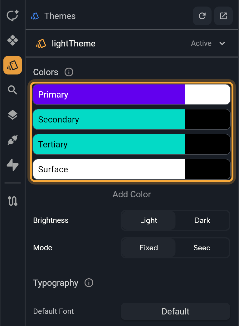
In a project you imported, colors can change the first time you open the Themes panel. A theme that doesn't set its own colors yet gets a purple palette to start from, so set your colors again in Colors.
Create a theme
Add a theme when you want a second look for your app, such as a high-contrast version or a seasonal one.
- Show all themes, then click Create New Theme at the end of the list.
- Type a name, such as
holidayTheme, and press Enter. Use letters, numbers and underscores, and don't start with a number. Nowa tells you if a name is empty, already taken or reserved.
The new theme opens for editing in Seed mode with a purple seed color, so you can restyle it from one color right away. It isn't applied yet, so your app keeps its current look until you apply the new theme.
Apply a theme
Click a theme in the list and the Active label moves to it. The active theme is the one your app starts with and the one the board shows. Nowa saves your choice with the project.
In a new project, your app doesn't switch between light and dark by itself: it uses the Active theme until you give people a way to switch. To add a dark mode button, see Switch themes while the app runs.
Rename or delete a theme
Right-click a theme.
- Rename: type the new name and press Enter. Nowa updates every place in your app that uses the theme, so nothing breaks.
- Delete: removes the theme. If other parts of your app use it, Nowa lists them and asks before it deletes. You can't delete the Active theme: Delete is greyed out and says The applied theme, so apply another theme first.
Edit colors
A theme colors your app by role. Instead of painting each widget, you decide what your main color, your accents and your backgrounds are, and each widget uses the role it needs. The Colors section shows the main roles as tiles: Primary, Secondary, Tertiary and Surface. Each tile also shows its matching "on" color, the one used for text and icons on top of it.
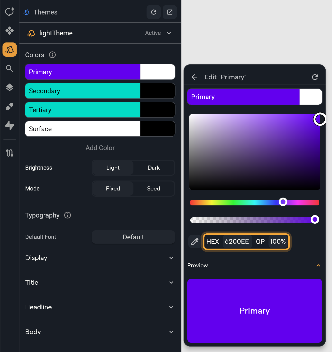
- Click a tile. A popup opens.
- At the top, choose the role on the left, or its "on" color on the right.
- Pick a color. Drag in the color area, use the hue and opacity sliders, pick a color from your screen with the eyedropper, or type a HEX code (a six-character color code such as
6200EE, the kind a brand guide lists) and an opacity (OP). - Check the result in Preview, then click the back arrow. Widgets that use the role have already changed on the board.
Not sure which role is which? Here's what each one is for.
| Role | What it's for |
|---|---|
| Primary | Your main color, the one people see most: prominent buttons, the floating action button, selected and active states. |
| Secondary | An accent for less prominent parts, such as filter chips. |
| Tertiary | A contrasting accent that balances the other two or draws attention to something, such as an input field. |
| Surface | The background of your screens. |
| Error | Error messages, such as a text field's "Enter a valid email". |
| Shadow | The shadows under raised widgets, such as cards and buttons. |
| "On" colors, such as On Primary | Text and icons on top of that color. Pick one that's easy to read against it. |
To edit another role, click Add Color and choose it in Override Color Role, for example Primary Container (for parts that need less emphasis than Primary), Error, Outline (borders) or a Surface Container shade. The reset icon in a popup's header puts the role and its "on" color back to the palette's own colors.
Choose light or dark, fixed or seed
Below the tiles, four settings decide how the whole palette is built. If you're starting fresh, Seed is the quickest route to colors that look good together: pick one color and the theme works out the rest.
| Setting | What it does |
|---|---|
| Brightness | Light or Dark for this theme's colors. |
| Mode | Fixed starts from a standard set of light or dark colors and applies the roles you edit. Seed builds a full, matching palette from one color. |
| Seed Color | Seed mode only. The color the palette grows from, such as the main color of your logo. |
| Scheme Variant | Seed mode only. The character of the palette, see below. |
Switching Brightness turns every color you haven't edited into its light or dark version, in either mode. Colors you've set yourself stay exactly as you chose them, so check that they still read well after the switch.
Switching Mode carries your main color over: your Primary color becomes the Seed Color, and the other way round.
| Scheme Variant | What you get |
|---|---|
| Tonal Spot | Soft, muted colors. Used when you don't pick a variant. |
| Fidelity, Content | Colors that stay close to your seed, even a very bright one. |
| Vibrant | The most colorful version of your main color. |
| Expressive | A main color that drifts away from your seed, for variety. |
| Neutral | Nearly gray, with a hint of color. |
| Monochrome | Shades of gray only. |
| Rainbow, Fruit Salad | Playful palettes in which your seed's own color doesn't appear. |
It's safe to experiment: step through the variants and watch the board, then undo with Ctrl/Cmd + Z if you liked the earlier look better.
Edit text styles
Typography lists the 15 text styles your app uses, grouped as Display, Title, Headline, Body and Label, each in Large, Medium and Small. Every row shows the style's weight and size, so you can see your whole type scale at a glance.
| Group | Use it for |
|---|---|
| Display | The biggest text on a screen: short, important words or numbers, such as a price or a score. Works best on large screens. |
| Headline | Short, eye-catching text on smaller screens, such as a screen's main heading. |
| Title | Shorter text that should stand out a little, such as a card's title or a section name. |
| Body | Longer text, such as a description or an article. Body Medium is the default style for text. |
| Label | Small, practical text, such as captions. Button text uses Label Large. |
- Optional: click Default Font to set one font for the whole theme. Every style uses it unless you give the style a font of its own. See Fonts and icons.
- Expand a group, then click a style, or hover it and click Edit.
- Set Font Family, Font Weight, Decoration, Font Size, Color, Background, letter spacing, line height and Shadows. Preview shows the result as you go, and every text that uses the style changes with it.
If you don't see Default Font, the theme was set up in code in a different way, as can happen in an imported project. Set Font Family on each style instead, or ask Nowa AI to set the font.
To start one style over, hover the icon at the start of its row and click it (Reset to default). Once you've customized any style, a refresh icon appears next to Typography: Reset all to default puts all 15 back.
Style text fields and buttons
Widgets sets the look of two kinds of widgets across your whole app, so every text field and every button matches without styling each one.
- Fields: every text field. Set the fill, borders, label, hint and error styles, and more.
- Buttons: choose Button or Icon Button, then set Background Color, Foreground Color (the text and icon color), Shadow Color, Elevation (how raised it looks), Side (its border) and Radius (how round its corners are). The reset icon restores the default button style.
New buttons and icon buttons follow these styles from the start. To check or change which style a button uses, see Connect buttons to the theme.
Widgets that keep their own color
Most widgets you add start with your theme's look. A new text, button or icon has no color of its own, so it follows the theme. Boxes are the main exception: a Container, whether you add it as a widget or draw it with the Shape tool, starts light gray. A few other widgets, such as TabView, and many templates bring fixed colors of their own too.
A widget follows the theme as long as its color field shows a role's name, such as primary, or the name of a color from a theme extension, such as brand. Once you give a widget its own color, picked in the color picker or typed as a HEX code, it keeps that color when you edit the theme. The same goes for a text style you've cut loose from the theme. That's handy for a one-off accent, and it's usually the reason when a widget doesn't change with your theme.
To bring a widget back, pick one of the theme's colors for it, or a theme text style. See Use theme colors and text styles.
Edit theme extensions
A theme extension is an extra set of values your theme carries beyond the standard roles, such as your brand colors. If your themes have extensions, the editor shows one tab per extension, named after the set, such as AppColors. Click a tab to edit its values.
Most themes also keep a Default Theme tab first, with the colors and text styles described above. A theme that your project's code builds in another way, for example from another theme, shows only its extension tabs.
There's no button to create an extension in the panel, because extensions come from your project's code. The no-code way is to ask Nowa AI in Agent mode, for example: "Add a theme extension with my brand colors, #0F766E and #F59E0B." Then open Themes and check that the new tab is there. Nowa supports up to 8 theme extensions in a project.
Add themes to a project that has none
Projects you create in Nowa come with themes. A project without Nowa's theme setup, such as one you imported, shows an error in the Themes panel and a Create Theme Setup button.
- Click Create Theme Setup. A dialog lists the files Nowa will add.
- Click Create.
Nowa adds a light and a dark theme (lightTheme and darkTheme) and the AppState global state, which lets your app switch between them while it runs (see Switch themes while the app runs). It skips any of these it finds already in your project. Once the panel reloads, you can edit colors and text styles as described above.
Or ask Nowa AI: "Use a warm orange as the primary color and make the headlines bold." Then check the result in Themes and on the board. With the Figma connection on, it can also turn your Figma colors and text styles into your theme. See Connect Figma and Supabase to Nowa AI.
Next steps
- Use theme colors and text styles on your widgets.
- Fonts and icons: pick a Google Font or import your own.
- Change widget properties.