Change widget properties
Select a widget and Details lists everything you can change about it, from color and spacing to text and what happens when someone taps it. Edit a value and the board follows as you type, so you see the result straight away. When a value should change while your app runs, such as the name on a product card, link it to your data instead of typing it in.
Open the Details panel
Details floats at the top right of the board, under Variables. Select a widget on the board or in the Outline to see its properties. Click the title bar to collapse the panel, and drag its left edge to make it wider or narrower. Code mode doesn't show it. With nothing selected on a board, Details shows the board's settings.
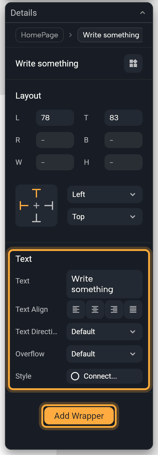
From top to bottom, Details shows:
| Section | What it holds |
|---|---|
| Breadcrumbs | The screen or component the widget is in, the widget it sits in, and the widget itself. Click a name to select it. |
| Name | The widget's name. Plain widgets have a Create a component button (components). Screens and components have Rename, Open in New Tab (unless already open) and a line that reads Add description until you write one. |
| Layout | Position and size. See Lay out widgets. |
| The widget's own properties | A Text, for example, lists Text, Text Align, Text Direction, Overflow and Style. |
| One section per wrapper | See Add a wrapper. |
| Add Wrapper | The button at the bottom. |
Select several widgets and the name reads Widget x N. A property where their values differ shows Mixed, and a change you make applies to all of them, which is handy for giving several buttons the same color at once.
A Kept as code box means Nowa couldn't read the widget, so the board draws a placeholder instead. The box says why. Your app still includes the widget, so click Run to see it for real. To make it editable on the board, you can ask Nowa AI in Agent mode to rebuild it from built-in widgets, then check the board again. See What Nowa can show on the board.
Edit a value
Each property has an editor that fits what it holds. The board updates as you type. Click away to finish, or press Enter in a one-line box. Every change can be undone, so feel free to try things.
| The property holds | The editor |
|---|---|
| Text | A text box. A Text widget's text grows to several lines. Type $ to put a value inside the text, such as a person's name. No value shows null (empty). |
| A number | A number box, - when empty. Drag its left edge sideways to change the value. Some have a minimum, such as 0 for padding. |
| True or false | A switch. |
| A color | A swatch, a HEX box and an opacity box. Click the swatch to open the picker. A Container's picker also offers Solid and the gradients Linear, Radial and Sweep. To follow your theme, see Use theme colors and text styles. |
| A text style | The Style button. See Use a theme text style. |
| An icon | A button with the icon and its name. See Choose an icon. |
| An image, video or animation | Tabs such as Network, Asset and Bytes, and buttons such as Pick Image. See Images, videos and other files. |
| Padding | Two boxes, for horizontal and vertical space. Individual padding switches to left, top, right and bottom. |
| Alignment | Two sliders, X and Y, from -1 to 1. Rows and columns use a 3 × 3 grid (layout). |
| A choice | A dropdown of the allowed values. When the property may be empty, such as Overflow on a Text, the list starts with Default. Choose it to remove your value, so the widget's own default applies. A property with no value shows Default. |
| An event | + creates the logic, such as what a button does when tapped, and Edit reopens it. See Respond to taps and other events. |
| A widget | A button with the widget's name. Click it to pick another widget. The brush button selects the widget inside. |
| A list, such as Shadows | A header with the item count. Edit the count to add or remove items, or hover and click +. Drag a row's handle to reorder. Load More shows ten more after the first ten. |
| A set of settings, such as Border or Radius | A header with the name. Hover it to show + (add it) or a button that removes it. Its fields sit underneath, and the arrow folds them away. |
Some editors end with Show advanced options. Click it for rarely used properties, and Hide advanced options to fold them away.
Link a property to your data
Link a property when it should follow a variable, a param or a calculation instead of a fixed value. For example, link a Text's text to a product's name, so every card in your shop shows its own product.
- Click the property's name, not its value. The link menu opens, titled Link plus the property's name.
- Pick a variable, a param, a function or an expression. The property now shows the name of what it's linked to.
- To go back to a fixed value, click the name again and choose Detach.... The property keeps its current value.
The menu can also create a param or a variable on the spot (Create Param..., Create Variable...) and open a formula editor (Custom Expression...). Expressions and conditions covers all of it.
Reset a property
Right-click a property and choose Reset to default. Nowa removes your value, so the widget uses its own default. A property that must have a value can't be removed, so Nowa keeps a fixed value there instead.
Set to null also appears for properties that are allowed to be empty. It empties the property on purpose. Both can be undone.
Add a wrapper
A wrapper is a widget that goes around another to add a look or a behavior. Wrap a picture in Padding to give it breathing room, or in a Container for a background color, a border or rounded corners. Others make a widget respond to taps (Gesture Detector) or scroll (Scroll View). The widget itself stays as it is.
- Select one widget on the board or in the Outline.
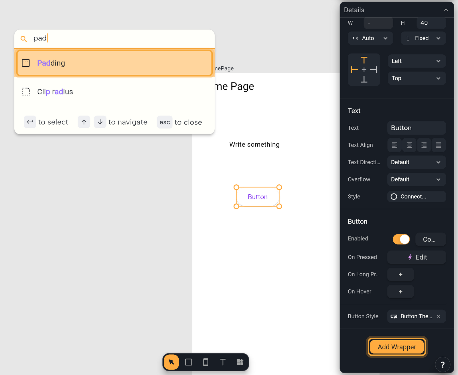
- Click Add Wrapper at the bottom of Details. A search box opens with the hint Search for a wrapper.
- Type part of a name, such as
pad, then click a wrapper or press Enter. The wrapper gets its own section in Details, except a Padding on a group, which shows in the group's own Padding row. - Edit its properties there. A new Padding starts with 8 on every side.
Think of wrappers as layers around the widget. Each new one goes around the ones you already have, so it appears below them in Details, and a section lower in the list is outside the ones above it. That's why order changes the result: with Padding below Container, the space is outside the container's color. Swap them and the space is inside.
- Reorder. Hover a wrapper's name and drag the grip that appears. A line shows where it will land.
- Remove. Hover the wrapper's name, click the three dots, then choose Remove. Undo brings it back.
Add Wrapper is hidden when you select several widgets. Nowa has 32 wrappers, from Padding and Visibility to Gesture Detector and Scroll View. Wrappers lists them all and what each one does.
Select a widget, then ask in Agent mode: "Add 16 px of space around this and round its corners." Check the result in Details. See Give Nowa AI context.
Next steps
- Lay out widgets: rows, columns, stacks and sizes.
- Use theme colors and text styles: link colors and text to your theme.