Use theme colors and text styles
Linking is what makes a theme work. When a widget's color or text style is linked to your theme, it follows every change you make there: make your primary color a little brighter, and every button and header that uses it brightens too, on the board and in your app.
Use a theme color
- Select a widget and click a color swatch in Details, for example a Container's Color.
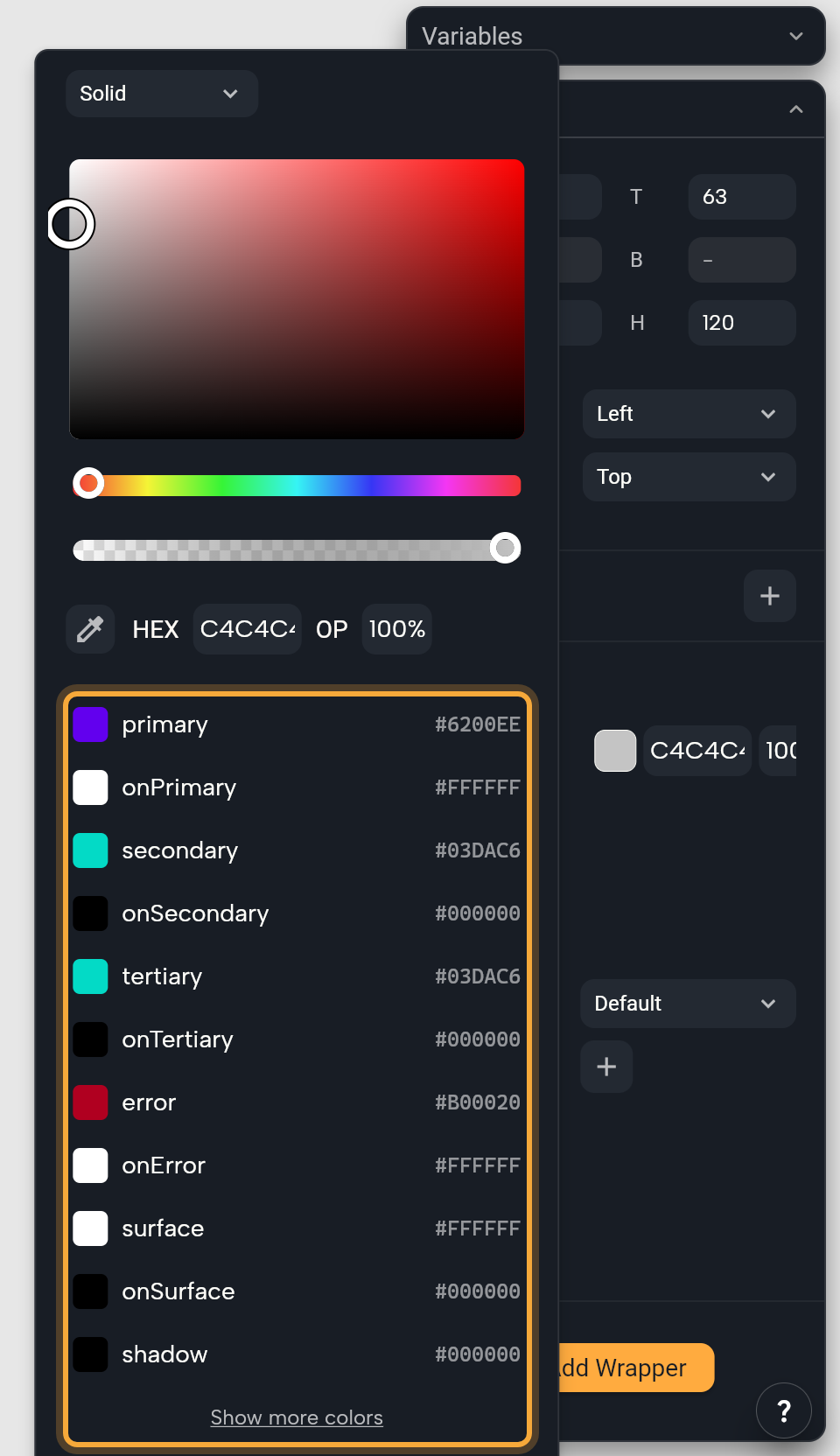
- Below the color picker, click a theme color such as
primaryorsurface. Click Show more colors for the container, fixed, surface and outline roles. - The field now shows the role's name. From now on, when that role changes in the theme, the widget changes with it.
The list shows your Active theme's colors. They're the roles from the Themes panel, written the way a field shows them, so On Primary appears as onPrimary. To change a theme color without leaving the widget, hover it and click Edit. You're editing the active theme itself, so every widget linked to that role updates too.
To stop following the theme, click the x on the field, or the detach icon next to Colors From Theme. The widget keeps the color it has now, as a fixed color that no longer changes with the theme.
Colors from theme extensions
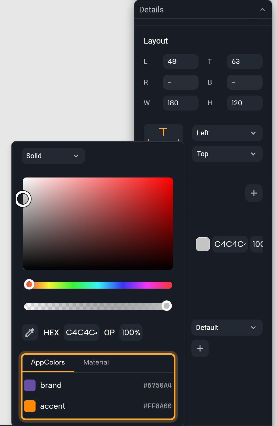
If your project has theme extensions with colors, such as a set of brand colors, the list has one tab per extension, named after the set, such as AppColors. A last tab, Material, holds the standard roles above and Show more colors. The picker opens on the tab of the color the field uses. A field that isn't linked yet opens on your first extension.
Pick an extension color and the field shows its name, such as brand. Extension colors have no Edit button here, so change them in the Themes panel, on the extension's tab. Working in the code? See What Nowa adds to your code.
Make a theme color transparent
Sometimes you want a lighter touch of a theme color, such as a soft tint of your primary color behind a badge.
- Link the property to a theme color, as above.
- Click the property's name, for example Color, to open its menu, then choose With values.
- Set Alpha from 0 (fully clear) to 1 (solid). It starts at 0.5, half see-through. Show more reveals Red, Green and Blue.
The widget still follows the theme, and the theme color itself doesn't change, so other widgets that use it keep it solid.
In an older project, a color made transparent the old way shows the note "withOpacity is now deperecated use withValues instead" with an Update button. Click Update to switch it to With values. The color looks the same.
Use a theme text style
- Select a Text widget and find Style in Details. The button shows the style in use, such as
bodyMedium, the default for text. - Click the button and choose a style in Text Styles, for example
headlineSmallfor a screen's heading. See what each style is for. - To change the style for the whole app, hover it in the list and click Edit. You're editing the active theme, so every text that uses the style changes too.
If your theme extensions have text styles, Text Styles lists them first, each extension's styles under a header with its name, and puts a Material header over the standard styles. Without extension text styles there are no headers. Extension styles have no Edit button here either.
Sometimes one text needs to differ a little, such as a crossed-out old price next to a sale price. To change only part of a style on one text, click Style (the property's name) and choose CopyWith, which copies the theme style so you can change parts of it. Then change the fields that appear, for example click the strikethrough button under Decoration.
Everything you leave alone still follows the theme, so if you make the style bigger in the theme later, this text grows with it. Remove CopyWith goes back to the plain theme style. On a text that still uses the default style, the menu item is Modify Style instead.
To cut the text loose from the theme, click the x on the style button. The style becomes this text's own and starts empty, so set the fields you need, such as Font Size and Color.
Connect buttons to the theme
A new Button or Icon Button already follows the theme: its Button Style shows Button Theme or Icon Button Theme. You change those styles once, in the theme under Widgets → Buttons, and every connected button follows. See Create and edit themes.
- To give one button its own look, such as a red Delete button, click the x on Button Style, then set Background Color, Foreground Color, Shadow Color, Elevation, Side and Radius.
- To go back, click Button Style (it now reads Connect...) and choose Default theme in Connect to Theme.
If no theme is applied to your app yet, clicking Button Style opens Create Theme Setup instead. See Add themes to a project that has none.
Switch themes while the app runs
Want a dark mode button? New projects include a global state called AppState: data and functions (actions your app can run) that every screen of your app can use. One of its functions, changeTheme, switches the theme while the app runs, for example from lightTheme to darkTheme. Your app doesn't follow the device's dark mode setting by itself, so a button like this is how people get dark mode.
- Select a Button on a screen and click the button next to On Pressed, the event that runs when someone taps it. It reads Edit on a new button, or + if the button has no action yet. Circuit, the visual logic editor, opens.
- Hover the dot under the top node, click +, open GLOBALS and click
AppState. - In the node's Details, click + and choose
changeTheme. - For Theme, click Select theme and choose a theme under THEMES, such as
darkTheme.
Now click Run and tap the button: your app switches to the dark theme. To switch back, give a second button lightTheme. For more on global states, see Share data across your app.
Each time your app opens, it starts in the Active theme again. To remember someone's choice, ask Nowa AI in Agent mode, for example: "Save the theme people pick on the device and use it when the app opens." Then run the app, switch themes, close it and open it again to check.
Bring in a theme from Figma
Already have your colors and text styles in Figma? With the Figma connection on, ask Nowa AI in Agent mode to use them as your theme, for example: "Use the colors and text styles from my Figma file as the app theme." It adds them to your project and reloads your themes. Then look at the board and the Themes panel to see what changed. Connect Figma first: see Connect Figma and Supabase to Nowa AI.
Or ask Nowa AI: "Make all my buttons use the secondary color from the theme." Then select a button and check that its color fields show theme names such as secondary.