Lay out widgets
Layout decides where each widget sits and what it does when the space changes: on a small phone, a big tablet or a browser window someone drags wider. You set all of it in Details, so you never have to nudge things into place for each device.
It comes down to three choices: put widgets that belong together in a group, decide how the group arranges them, then decide how much room each widget takes.
Pick the right arrangement
Every group arranges its widgets in one of three ways, and so does a screen's main group, the one that holds its content.
| Arrangement | What it does | Good for |
|---|---|---|
| Column | Puts widgets one below the other. | Most screens: a sign-up form, a profile page, a list of settings. |
| Row | Puts widgets side by side. | An icon next to a label, a price next to an Add to cart button. |
| Stack | Layers widgets on top of each other, each at its own spot. | Things that overlap or sit at an exact place: a "Sale" badge on a photo, a title over a banner. |
The big difference is how they react to change. In a Column or Row, widgets make room for each other: if a recipe title runs onto two lines, everything below it moves down. In a Stack, each widget stays put and nothing moves out of the way, so you tell each one which edges to stick to.
That's why a Column is the usual choice for a screen's content, and a Stack is for the parts that overlap. You can nest them too. A recipe card can be a Column (photo, title, description) whose last line is a Row (cooking time on the left, a heart button on the right).
A screen made from the Empty Page template starts as a Stack, so you can drop widgets anywhere while you sketch. When you want the content to flow, switch it to a Column, as shown below.
Groups
A group holds widgets that belong together, so they move, line up and resize as one piece. Think of a product card: the photo, the name and the Buy button should never drift apart, so you group them. Every group is a Stack, a Row or a Column, and you can switch at any time.
To group widgets:
- Select them on the board or in the Outline. Hold Shift and click to add each one.
- Press Ctrl/Cmd + G, or right-click and choose Group.
If the widgets already sit together in a Row, Column or Stack, the new group is the same kind as their parent. Anywhere else it's a Stack, so every widget stays exactly where it was.
To take a group apart, select it, right-click and choose Ungroup. The widgets stay, and only the group goes. Pressing Ctrl/Cmd + G on a group doesn't ungroup it: it puts the group inside a new one.
You can also start from an empty group in the Library: press Ctrl/Cmd + K, type group, select Group and press Enter.
For widgets placed freely, such as on an Empty Page screen, draw a shape with the Shape tool that covers them all (if it hides them, right-click it and choose Send to back). Click the shape first, Shift-click each widget, and group them. Nowa turns the shape into the group's background instead of adding it as one more widget, and the group keeps that color even after you switch it to a Row or Column.
Switch between stack, row and column
Select a group, or click a screen's title to change the screen's main group, and find the Group section in Details. Its header has three buttons: the first makes the group a Stack, the right arrow a Row and the down arrow a Column.
When you turn a Stack into a Row or Column, Nowa lines the widgets up in the order they sit on the screen: top to bottom for a Column, left to right for a Row. The space between the first two becomes the Gap. If you don't like the result, Ctrl/Cmd + Z switches it back.
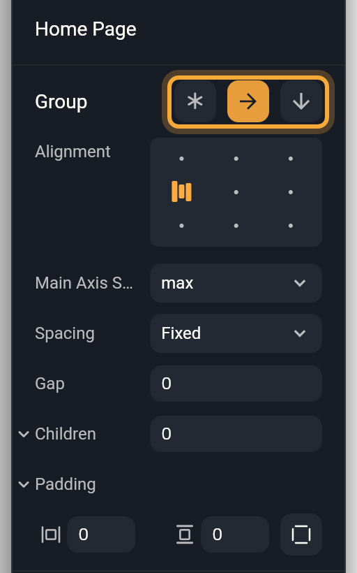
Padding in the Group section adds space inside the group, between its edges and its widgets. Type one value for the left and right sides and one for the top and bottom, or click Individual padding to set each side on its own. Nowa adds a Padding wrapper around the group for you.
Point at the section and a ⋯ button appears to the left of the three buttons. Its Replace with... swaps the group for another widget.
Stack settings
A Stack group also has these settings:
| Setting | What it does |
|---|---|
| Alignment | Where widgets sit in any direction they aren't pinned in. X goes from -1 (left) to 1 (right) and Y from -1 (top) to 1 (bottom). A stack you make in the editor starts at 0 and 0, the middle, and so does a screen made from Empty Page. |
| Fit | How big widgets with no pin and no fixed size get. loose lets them keep their own size, expand stretches them to fill the stack, and passthrough passes on the size limits the stack itself gets. Screens made from Empty Page use expand. |
| Text Direction | Left to right (ltr) or right to left (rtl). You rarely need it: on a stack it doesn't flip the widgets or the text inside, so leave it on Default. To mirror a section for a right-to-left language, use the Text Direction wrapper instead: see Languages and right-to-left text. |
| Clip Behavior | Whether parts of widgets that stick out past the stack's edges are cut off. none lets them show. hardEdge (the default), antiAlias and antiAliasWithSaveLayer cut them off, the last two with smoother edges. |
| Children | The widgets in the stack, in order. Later ones sit on top of earlier ones. |
Rows and columns
A Row runs left to right and a Column runs top to bottom. Its settings place the widgets along that direction and across it. Select a Row or Column and open the Group section.
| Setting | What it does |
|---|---|
| Alignment | A 3 × 3 grid that works like a map of the group: click the cell where the widgets should gather, such as bottom center. With Fixed spacing all nine cells work. With other spacing, only the position across the group applies: left, center or right in a Column, and top, center or bottom in a Row. |
| Main Axis Size | How long the group is in its own direction. max takes all the room available. min is only as long as its widgets, for example a row of buttons that's no wider than the buttons themselves. |
| Spacing | How the free space is shared out. Fixed keeps the widgets together, with a Gap between them. Between puts the first and last widgets at the edges and spreads the rest evenly, like a title on the left and an icon on the right. Around gives each widget the same space on both sides, so the ends get half as much. Evenly makes every space the same, ends included. |
| Gap | The space between widgets. It shows only with Fixed spacing and can't go below 0. |
| Children | The widgets in the group, in order. Hover a row and drag its handle to reorder. Hover Children and click + to add a copy of the last widget, handy for repeating a card or a menu item. |
You can also reorder by dragging widgets on the board or in the Outline, or select one and press an arrow key along the group's direction to move it one place earlier or later.
Place widgets in a stack
In a Stack, each widget remembers its distance to the stack's edges, which are usually the edges of the screen. Select a widget in a Stack, for example anything you dropped on an Empty Page screen, and open Layout in Details.
- L, T, R and B are the distances to the left, top, right and bottom edges. Only the edges the widget is pinned to have a value. The others are greyed out.
- W and H are the width and height. When the widget has a natural size, a dropdown under them offers Fixed and Auto (see Size widgets).
Choose what each widget sticks to
Constraints decide which edges a widget keeps its distance to when the stack changes size, for example when your app opens on a bigger phone or someone widens the browser. Pick one option across and one down.
| Across | Down | As the screen grows, the widget... | For example |
|---|---|---|---|
| Left | Top | stays the same distance from the left or top edge. | A back button in the top-left corner |
| Right | Bottom | stays the same distance from the right or bottom edge. | A Next button in the bottom-right corner |
| Left and right | Top and bottom | keeps both distances, so it stretches. Its W or H is greyed out, because the distances set it. | A search bar that spans the width |
| Center | Center | sits at the stack's Alignment, the middle unless you changed it. | A logo that stays centered |
Pick them in the two dropdowns, or click the bars in the constraints box: the bar on a side pins that side. Shift-click the opposite bar to pin both sides. The + in the middle removes every pin, the same as Center both ways. Constraints work on several selected widgets at once.
Two things to know about Center:
- Choosing Center in either dropdown unpins the widget both ways, so it moves to the stack's Alignment. To center a widget across but pin it to the top, choose Center first, then Top, and type the distance you want in T.
- Dragging a centered widget pins it to the left and top again. Set Center last, once you're done dragging.
To see your constraints at work, click the screen's title and change its Size in Details, or drag a corner of the screen. If a widget drifts somewhere you didn't expect, check its constraints first.
Size widgets
Every widget has a width and a height. Select it and open Layout: W and H usually each have a dropdown that decides how that size is set.
| Mode | What it does | Good for |
|---|---|---|
| Fixed | Keeps the size you type, whatever the content or the screen. Switching to Fixed fills in the current size, so nothing jumps. | An avatar, an icon, a thumbnail |
| Auto | Fits the content, plus any padding you added. Offered only when the widget has a natural size, such as a text or an icon. | A label, or a group that should hug what's inside |
| Expand | In a Row or Column. Along the row or column, it takes the space that's left, and widgets that expand share it equally. Across, it fills the full width or height. | A text field that fills the width, a card that takes the rest of a row |
Expand only works in a Row or Column. A Wrap, which flows its widgets onto new lines, offers it too, but there, choose Fixed or Auto.
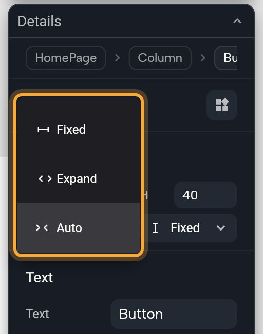
The Layout section depends on where the widget sits:
- A screen or a loose widget on the board shows X, Y, W and H.
- A widget in a Stack shows the distances and constraints above.
- A widget in a Row, Column or Wrap shows W and H with Fixed, Auto and Expand.
- A widget in a List View (a scrolling list) shows W and H with Fixed and Auto.
- A widget with any other parent shows an empty section. Click its + to give it a W and H.
Scroll or wrap content
- Scroll View: when a Column may grow taller than the screen, such as a long article or a settings page, select it, click Add Wrapper and choose Scroll View. Inside a Scroll View, Expand isn't offered in the scrolling direction, because a scrolling area has no end to fill. For a Row that scrolls sideways, such as a strip of category cards, set Scroll Direction to
horizontalin the wrapper's section (verticalis the default). Wrappers explains the other settings. - Wrap: add it from the Library (Ctrl/Cmd + K). Its widgets sit side by side and continue on a new line when they run out of room, like tags or filter chips.
- List View: add it from the Library for a scrolling list, such as your recipes or a shop's products. It starts with three placeholder items that repeat one item design. See Lists and grids.
Try "Put these three cards in a column with 16 px between them and make it scroll." Then select the column and check Spacing and Gap in Details, so you know how to adjust it yourself.
Next steps
- Design for every screen size uses these tools to make one layout fit all devices.
- Select, move and resize shows how to group, reorder and resize on the board.
- Change widget properties, including Add Wrapper.