Lists and grids
Most apps are full of lists: products in a shop, messages in a chat, bookings for the week. A List View or Grid View repeats one item design for every entry in a list. You design the item once, connect a list, and Nowa fills the screen. A Swipeable Stack does the same with a deck of cards that people swipe away, and List Tile and Expansion Tile give you ready-made rows.
Choose Builder or Normal
Both widgets have a Type switch in Details.
| Type | Use it for | How it works |
|---|---|---|
| Builder | Items that come from a list, such as products, messages or search results. | You design one item. Nowa repeats it Item Count times and only builds the items that are on screen, so even a long list stays fast. A new List View or Grid View starts here. |
| Normal | A fixed set of different widgets, such as a settings menu. | You add each widget yourself under Children. It works like a column (or row) that scrolls. |
Add a List View
- Press Ctrl/Cmd + K, search for
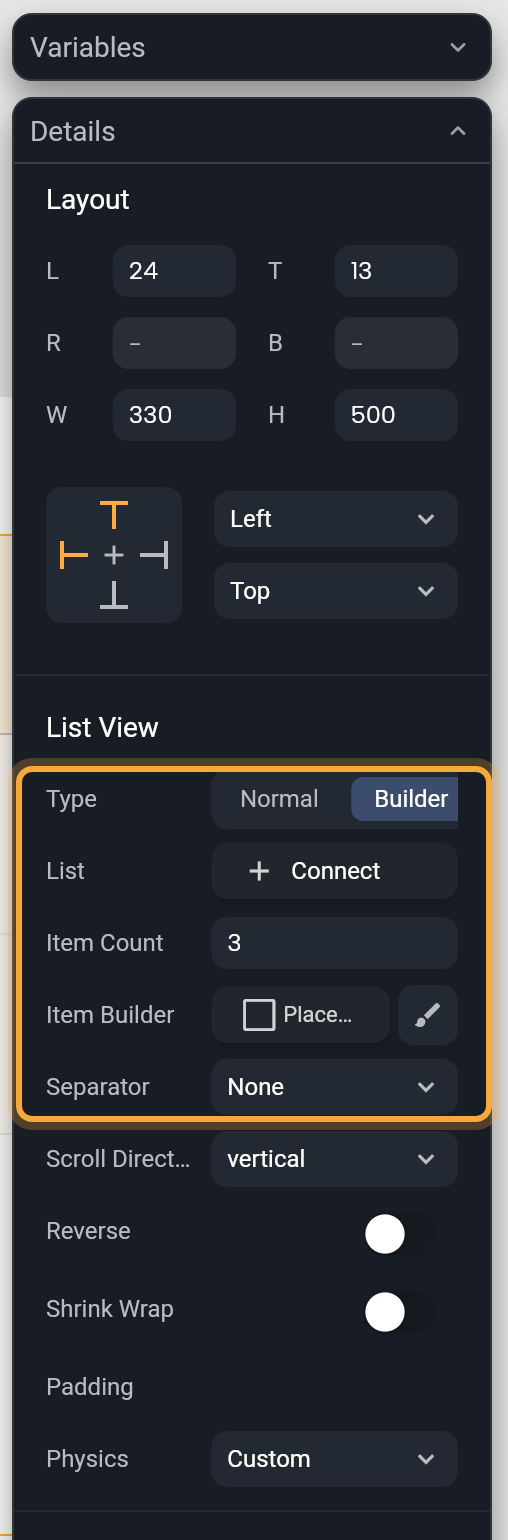
list view, check the highlighted result and press Enter. It starts as a Builder with three placeholder items. - Click the Item Builder button and choose Pick Widget. Pick a built-in widget or one of your own components.
- Select the item on the board or in the Outline and design it like any widget.
- Type a number in Item Count to preview the list with more or fewer items. Once you connect a list, its length takes over.
- Choose a Separator: None, Fixed Spacing (then set Spacing, which starts at 20) or Widget, which adds a thin gray Divider between items. To restyle it, select the Divider with the brush next to Separator (the brush shows while the board draws a divider). Then change its Color, Thickness, Height (the space it takes between items) or Indent.
If the list sits in a Column, set its height to Expand in Layout so it fills the space that is left. See Lay out widgets.
Change how a list scrolls
Below the item settings, a List View and a Grid View share these scroll settings:
| Setting | What it does |
|---|---|
| Scroll Direction | vertical, the default, or horizontal for a row of cards that people swipe sideways. |
| Reverse | Starts from the other end, such as the bottom of a chat. |
| Shrink Wrap | Makes the list only as long as its items instead of filling the space. Handy for a short list inside a screen that already scrolls. |
| Padding | Space around the items, inside the scrolling area. Hover the row and click + to add it; the Individual padding button then sets each side. |
| Physics | How scrolling feels. BouncingScrollPhysics bounces at the ends, as on iPhone. ClampingScrollPhysics stops at the ends, as on Android. NeverScrollableScrollPhysics turns scrolling off, for example for a short list inside a scrolling screen. AlwaysScrollableScrollPhysics lets people scroll even when everything fits. PageScrollPhysics snaps one page at a time. |
Fill a list from your data
Design the item with placeholders first and connect the list at the end: your design stays as you made it.
- Get a list to show. It can be a list variable (tick As List, see Store data in variables), or the result of a request or query (see Show data in your UI).
- Select the List View. In Details, make sure Type is Builder, then click List. It reads Connect.
- Open LOCALS and click your list. List now shows its name, and Item Count follows the list's length.
- Select a widget inside the item. Click the label of a property, open LOCALS and click
element, the entry the item is showing. Ifelementis a model, pick one of its fields.indexis the entry's position, starting at 0.
To stop following the list, click the detach icon next to its name.
A component makes a good item. Give it params, use it as the item, and link each param to element. See Pass values to a component.
To open a screen when someone taps an item, see Open a detail screen when a list item is tapped.
Example: a grid of plants
Here's how the pieces fit together, using a small plant shop. You can follow it without a backend: sample entries stand in for real data, and later the data from your database replaces them.
- Create a model called
Plant, which describes what each plant holds: two text fields,nameandimageUrl. See Create a model. - On the screen, add a variable called
plants. In its type picker, tick As List and pickPlant. In Default Value, click + for each plant and fill in its name and picture address. See Use a model as a type. - Build the card once as a component called
PlantCard, with an Image and a Text. Give it a param, a value the card receives, calledplantof typePlant. Link the Image's Url to theimageUrlfield ofplant, and the Text to itsnamefield. - Add a Grid View to the screen. Click Item Builder, choose Pick Widget and pick
PlantCard. - Click List, open LOCALS and pick
plants. The grid now shows one card per plant. - Select a
PlantCardinside the grid. In Details, click the label of its param (it reads Plant), open LOCALS and pickelement. Each card now shows its own plant.
Know what the board shows
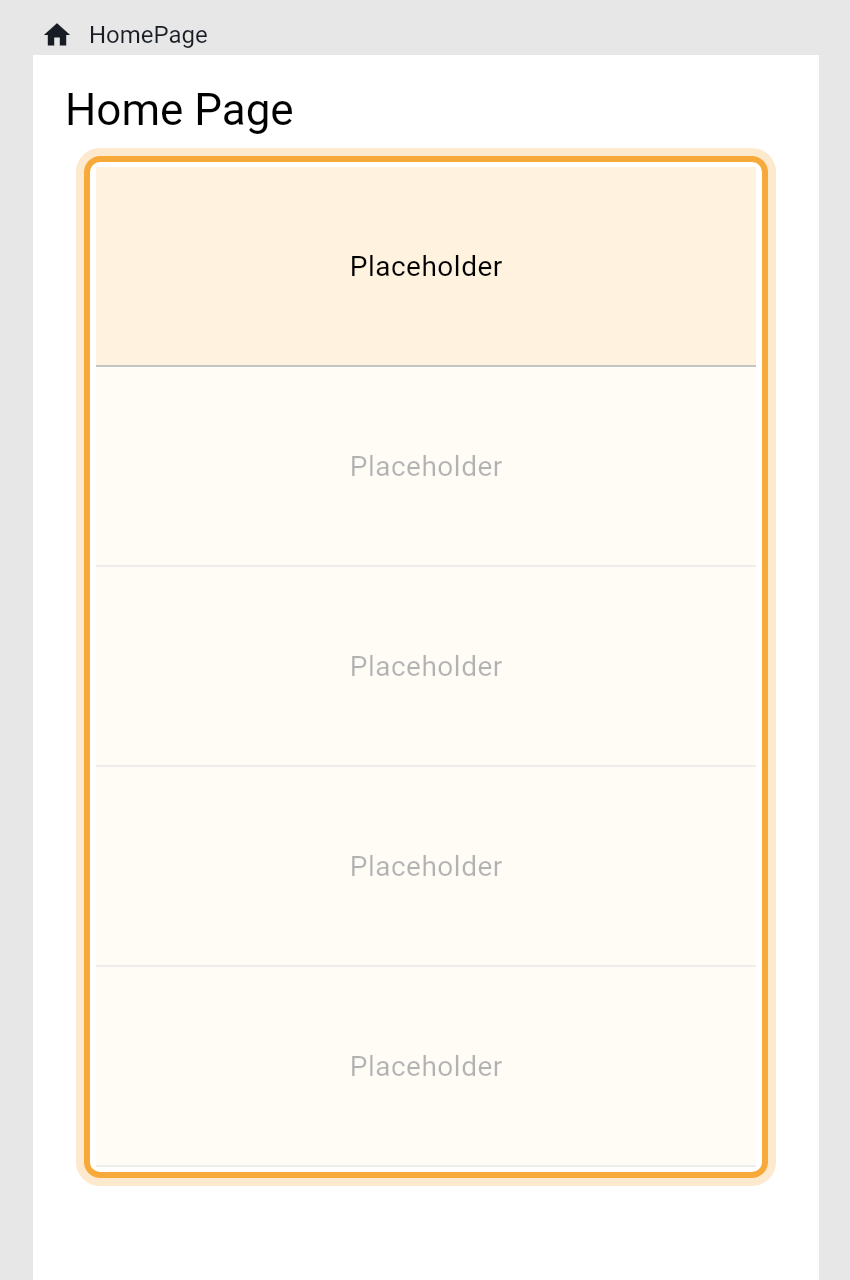
On the board, a Builder list or grid shows the first item at full strength and fades the rest. If the connected list has no entries yet, the board shows three sample items, so the design never looks blank.
Press Play to see every item at full strength with your real data. A list that is still empty stays empty in Play until your logic fills it. See Play your app on the board.
Build a list by hand
- Click Normal next to Type.
- Under Children, click + to add a widget, or drag a widget onto the list on the board.
- Drag the entries in Children to reorder them.
Switching from Normal to Builder keeps only the first widget, as the item design. If there is more than one widget, Nowa asks first: First Widget as Placeholder, Others will be Removed. Click Continue to go on or Cancel to rearrange. To keep another widget, drag it to the top of Children before you switch. Switching from Builder to Normal turns the item into the only child.
Got a list to show after all? Click the Children label and pick the list. Nowa switches to Builder and connects it in one go. Only the first widget stays, as the item design, so drag the one you want to the top first.
Add a Grid View
A Grid View works like a List View. It has the same Type switch, List, Item Count and Item Builder, and starts as a Builder with two columns and three placeholder items.
Below the item settings, choose how the columns are counted, then set the spacing. These notes assume a grid that scrolls up and down.
| Setting | What it does |
|---|---|
| Fixed | You choose how many columns fit across with Cross Axis Count. |
| Max | You choose the widest an item may be with Max Cross Axis Extent. Nowa fits as many columns as the width allows, so a tablet shows more columns than a phone. |
| Main Spacing, Cross Spacing | The space between rows, and the space between columns. |
| Main Axis Extent | A fixed height for every item. |
| Child Aspect Ratio | Item width divided by item height. It applies while Main Axis Extent is empty. |
To clear Main Axis Extent, right-click it and choose Reset to default.
Build rows with List Tile
A List Tile is a ready-made row: a title, an optional line under it, and room for an icon or a picture at each end. It's the classic row of a settings screen or a contact list, and it makes a quick item for a List View.
| Setting | What it does |
|---|---|
| Leading, Trailing | A widget at the start and at the end, such as an avatar and an arrow. Click the slot to pick one. |
| Title, Subtitle | The main text and the line under it. Title starts as a Text that says "Tile". |
| Is Three Line | Gives the subtitle room for two lines. It needs a Subtitle. |
| Dense | Makes the row shorter. |
| On Tap, On Long Press | Logic that runs when someone taps the row or presses and holds it, such as opening a detail screen. |
| Enabled | Turn it off to gray the row out and ignore taps. |
| Selected, Selected Color, Selected Tile Color | Highlights the row, such as the current choice in a menu, with its own text and icon color and its own background. |
| Tile Color, Text Color, Icon Color | The background, text and icon colors. |
| Title Text Style, Subtitle Text Style, Leading And Trailing Text Style | A text style for each part. |
| Content Padding, Horizontal Title Gap, Min Leading Width, Min Vertical Padding | The space around the content, the gap between the texts and the side widgets, the room kept for Leading, and the space above and below the texts. |
| Shape | The row's outline, such as rounded corners. |
Show more on tap with Expansion Tile
An Expansion Tile is a row that opens to show more, like a question in a FAQ that reveals its answer, or a "Shipping details" section in a checkout. What it reveals goes in Children, which starts with one placeholder: replace it, and click + to add more widgets.
| Setting | What it does |
|---|---|
| Initially Expanded | Starts open. |
| Title, Subtitle | The text people see while it's closed. Title starts as "Tile". |
| Leading, Trailing | Widgets at the start and at the end. A Trailing widget can take the place of the arrow. |
| On Expansion Changed | Logic that runs when it opens or closes. value is true when it opens and false when it closes. |
| Background Color, Collapsed Background Color | The background while open, and while closed. |
| Text Color, Collapsed Text Color, Icon Color, Collapsed Icon Color | The text and arrow colors, open and closed. |
| Shape, Collapsed Shape | The outline while open, and while closed. |
Show advanced options adds a few more. Enabled off stops it from opening. Show Trailing Icon off hides the arrow. Tile Padding and Children Padding set the space around the title row and around what it reveals. Control Affinity puts the arrow at the start or the end. Maintain State keeps what it reveals, such as text someone typed, while it's closed.
Add swipeable cards
A Swipeable Stack shows cards one on top of another, and people swipe the top card away. Think of a dating app, flashcards for learning words, or one recipe idea at a time.
- Add a Swipeable Stack. If Nowa shows Add Missing Dependencies, click Add: the cards need a package to work.
- Nowa adds a variable called
swiperControllerand links Controller to it. You'll use it for buttons that swipe for the user. - Design the card with Card Builder. The stack starts with five cards (Cards Count).
- Set Displayed Cards, how many cards show stacked. The board draws at most two. Press Play or Run to see the real stack.
- To show a list, click List and connect it, as for a List View.
elementis the entry on each card. - Choose which directions work with the four arrow buttons of Allowed Swipe Direction. Use Is Loop to start over after the last card, and On Swipe, On Undo and On End to react.
For buttons that swipe or undo, add a node in Circuit and pick swiperController under LOCALS. In Details, click + after it and choose swipe (swipes the top card away in the direction you pick), undo (brings back the last card) or moveTo (jumps to the card at a position).
Try "Show the products list as a grid with two columns. Each card shows the picture, the name and the price." See How Nowa AI works.
Next steps
- Show data in your UI to fill a list from an API, Supabase or Firestore.
- Build reusable components to design an item once.
- Widget catalog for every built-in widget.