Text fields and forms
Forms are how people talk to your app: signing up, booking a table, leaving a review. A Text Field is a box where people type. Nowa creates the variable that holds what they type, and you can add checks such as "required" or "valid email" without writing code. This page also covers dropdowns, code boxes, checkboxes, switches, sliders and popup menus.
Add a Text Field
- Point at the screen, press Ctrl/Cmd + K, search for
text field, check the highlighted result and press Enter. The field lands where your pointer was. See Add widgets. - Nowa adds a variable called
textto the screen or component and links the field's Controller to it. Open Variables to see it. The next Text Field gets the same name with a number added. A field that lands loose on the board, outside a screen, gets no variable.
That variable is a controller: it holds what the user typed, so the rest of your screen and your logic can read it. To use the text, click a property's label, open LOCALS, pick the controller and choose text. Give the controller a clear name, such as email, because the validator row uses its name too. See Rename, retype or remove a variable.
Removing a Text Field removes its controller variable too. If your logic used that variable, fix those steps afterwards.
Style the field
Select the field. These settings in Details matter most:
| Setting | What it does |
|---|---|
| Decoration | The look of the box. Hover the row and click + to add it, then set Hint Text, Label Text, Prefix Icon, Border (None, Outlined or Underlined), Filled with Fill Color, Error Text and more. |
| Obscure Text | Hides what is typed. Turn it on for passwords. |
| Keyboard Type | The keyboard a phone shows, such as Email, Number or Phone, so people get the right keys straight away. |
| Min Lines, Max Lines | How many lines of text the box shows. Raise Max Lines for a multi-line box, such as a review or a message. |
| On Changed | Runs every time the text changes. The new text arrives as value. See Respond to taps and other events. |
To style every text field in your app at once, use the Fields settings of your theme. See Create and edit themes.
Check what people type
Validators check the text and show a message under the field when it isn't right, such as "Invalid email", so people can fix it before they submit.
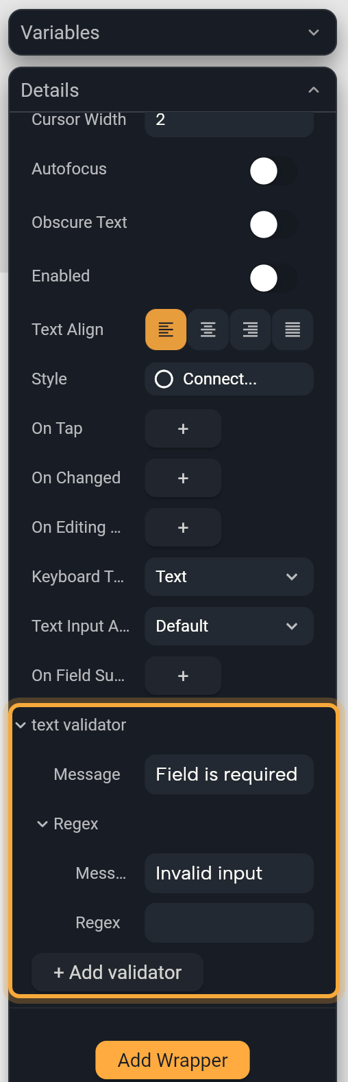
- Select the Text Field. In Details, hover the validator row. It's named after the controller, such as text validator.
- Click +, then click the arrow next to text validator to open it. A Required rule appears with a Message, which starts as "Field is required".
- Click + Add validator and choose a rule, for example Min length validator. Email, Phone and Regex can each be added once.
- Change each rule's Message, and the Regex field of a Regex rule.
| Rule | The message shows when | Starts as |
|---|---|---|
| Required | The box is empty. | "Field is required" |
| Min length | The text has fewer characters than the minimum. | "Too small", minimum 6 |
| Max length | The text has more characters than the maximum. | "Too long", maximum 40 |
| The text isn't a valid email address. | "Invalid email" | |
| Phone | The text isn't a valid phone number. | "Invalid phone" |
| Regex | The text doesn't match your Regex pattern, a regular expression that describes what valid text looks like, such as a postal code. Nowa AI can write the pattern for you. | "Invalid input" |
Nowa checks the rules from top to bottom and shows the message of the first one that fails. To remove a rule, hover its title and click the remove button. Required, Min length and Max length show no title or remove button: click the remove button on the validator row to remove all the rules.
Validators run only when your logic asks the form to check, as Check the whole form shows.
Length rules in Nowa 3.13
A Min length or Max length rule has a catch in Nowa 3.13. Right after you add it, it shows as a plain Message row, like Required, with no Min or max field. The length check still works, with the starting number from the table above.
Editing that Message is safe. Adding or removing another rule afterwards isn't: Nowa rewrites the row as a Required check and drops the length check. So add a length rule last.
To change the number, ask Nowa AI in Agent mode, for example: "Make the password field require at least 8 characters." Then check it in Play: type something shorter and tap your submit button, and the message should show. If you edit code yourself, change the number in code mode (see Edit code in Nowa).
Check the whole form
A Form groups fields so one step can check all of them, for example when someone taps Sign up.
- Select the group that holds your fields: click its row in the Outline, or click a field there and then its parent in the breadcrumbs at the top of Details.
- In Details, click Add Wrapper, search for
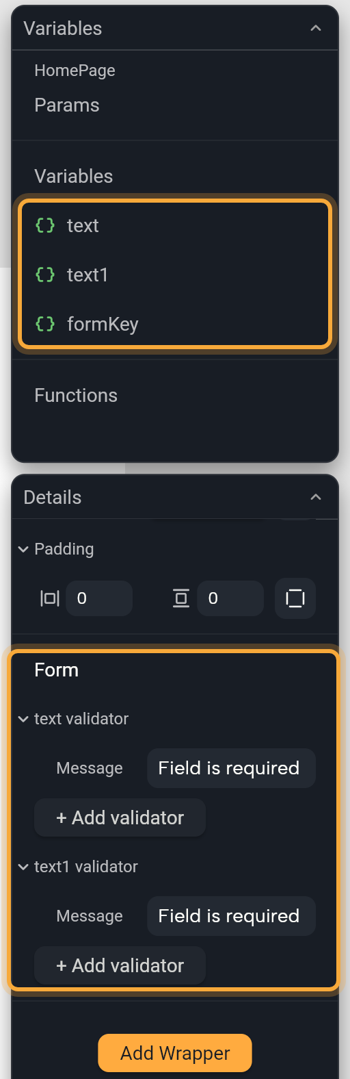
Formand press Enter. See Wrappers. - Nowa adds a variable called
formKey, which lets your logic reach the form. The Form section of Details now lists a validator row for every Text Field, Dropdown menu and Pin Code Field inside it, so you can set all the rules in one place. - Select your submit button.
- In Details, click the button next to On Pressed. Circuit opens.
- Hover the dot under the orange node, click the + that appears and choose Add If statement.
- In Details, click the Condition label, scroll down and open LOCALS, pick
formKey, then choosecurrentStateandvalidate. - Click the dot in the True branch and add what should happen when every field passes, such as saving the booking or opening the next screen.
validate checks every field and answers true when they all pass. Fields that fail show their messages. Press Play, leave a field empty and tap the button to see them.
Add a dropdown
A Dropdown menu lets people pick one option from a list, such as a size, a country or a delivery time.
- Add a Dropdown menu from the Library (Ctrl/Cmd + K). It starts with one option, "first".
- In Details, open Items and click + to add an option. Each option has a Value and a Child, the widget that shows it. A new option copies the last one, so change its Value and its text. Until you do, Details says "Values contain duplicates".
- Value type is the type of the values. It starts as text (String), which suits most dropdowns.
- Click the button next to On Changed to open it in Circuit. The option the user picked arrives as
value. Store it in a variable to use it elsewhere. See Change a variable from logic.
Decoration and the validator row work as they do on a Text Field.
Add a pin code field
A Pin Code Field shows a row of boxes for a short code, such as the one-time password a sign-in sends by text message.
- Add a Pin Code Field. If Nowa shows Add Missing Dependencies, click Add: the boxes need a package to work.
- Nowa adds a variable called
pinCodeand links Controller to it. Read the typed code withpinCodeand thentext, as for a Text Field. - Set Pin Code Length, from 1 to 6.
- Click Pin Theme to change colors, border widths, box size and shape. Turn on Enable Active Fill to color the boxes.
- Use On Completed to run logic as soon as every box is filled, so people don't need a separate Verify button.
Use checkboxes, switches and sliders
Checkbox, Switch and Slider work alike. Value holds the current state, and On Changed runs when someone changes it, with the new state as value. To remember the choice, click the label of Value and choose Create Variable.... Then open On Changed, set that variable to value and add refresh, which redraws the screen with the new value. See Store data in variables.
| Widget | Settings worth knowing |
|---|---|
| Checkbox | Starts checked. Tristate adds a third state that shows a dash, for "some of these are selected"; taps then go from unchecked to checked to the dash. Active Color fills the box when it's checked and Check Color colors the tick. Side is the box's border. Is Error shows it in error colors, for a box that must be ticked. Semantic Label is what screen readers say. Focus Color and Hover Color show on the web and desktop. |
| Switch | Starts on. Active Thumb Color and Active Track Color color the knob and the track while it's on. Inactive Thumb Color and Inactive Track Color do the same while it's off. |
| Slider | Min and Max set the range: 0 to 1 at first, starting at 0.5. Divisions makes it move in steps, such as 10 steps from 0 to 100. With Divisions set, Label shows above the thumb while someone drags it: type $ in it and pick your variable to show the current value. Slider Height is the track's thickness and Thumb Radius the knob's size. Active Color, Inactive Color, Thumb Color and Overlay Color set the colors. |
Add a popup menu
A Popup Menu Button opens a small menu when tapped, such as Edit, Share and Delete on a post. It starts as the text "Popup Menu" with one item, "Item 1".
- The items live in Item Builder. Click Edit next to it to change them in Circuit. The quickest way is to ask Nowa AI, for example: "Give this menu the items Edit, Share and Delete." Then tap the button in Play to check the menu.
- On Selected runs when someone picks an item, with that item's value as
value. On Opened runs when the menu opens, and On Canceled when it closes without a choice. - The button shows its Child, the "Popup Menu" text, which you can edit or replace. Tooltip is the hint people see on hover or a long press, and Color and Shape style the menu.
Update an older Text Field or dropdown
A project from an earlier version of Nowa can hold the older TextField or dropdown button, which can't use validators. Details then shows "TextField does not support validation, use TextFormField instead" with a Change button, or "You are using an old version of the dropdown button" with an Update button. Click the button to switch to the version that supports validators.
Try "Add a sign-up form with name, email and password fields, and show an error under the email field if it isn't a valid email." See How Nowa AI works.
Next steps
- Respond to taps and other events to build what happens on a tap or a typed letter.
- Store data in variables to keep what people choose.
- Widget catalog for every built-in widget.
- Form validation, a video walkthrough made with an earlier version of Nowa.