Navigation bars and screen parts
Most apps share the same frame around their screens: a bar on top with the title, a menu that slides in from the side, a round button for the main action and tabs along the bottom. A screen has a place for each of these standard parts: an App Bar on top, a Drawer at the side, a Floating Button over the content and a Bottom Navigation Bar at the bottom. Pick one for its slot and Nowa puts it in the right place.
Add a screen part
| Part | What it is | Screen setting in Details |
|---|---|---|
| App Bar | The bar at the top, with a title and actions. | App Bar |
| Drawer | A menu that slides in from the side. | Drawer |
| Floating Button | A button that floats over the content. | Floating Action Button |
| Bottom Navigation Bar | A row of tabs at the bottom. | Bottom Navigation Bar |
- Select the screen and open its Screen section in Details.
- Click the slot you want: App Bar, Drawer, Floating Action Button or Bottom Navigation Bar. An empty slot shows
null. At the panel's default width, the longer labels are cut short, such as Bottom Nav.... - In the widget picker, search for the part, such as Floating Button, and press Enter. The part sits in its own place, not in the body, so it stays put while the content scrolls.
The widget picker is the dialog with the hint Search for a widget. It offers your own components too, so a custom header you built can be the app bar. See Create and set up screens.
A part you drag from the Library onto the screen fills its slot only where none of the screen's groups is under the pointer. Over the Stack that fills the body of an Empty Page screen, it lands in the Stack, so use the slot.
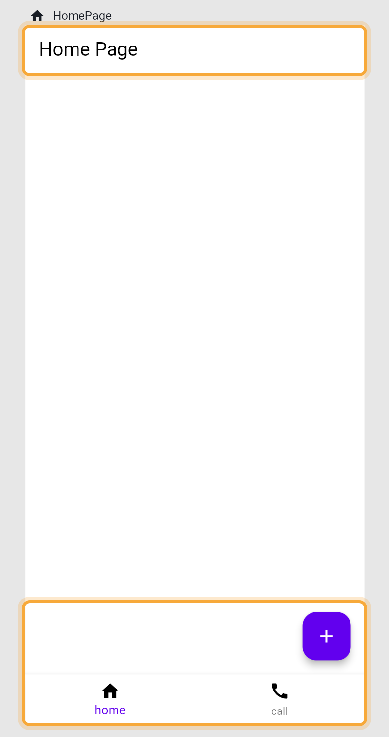
Set up the App Bar
Select the App Bar on the board, or in the Outline under the appBar slot.
- Title starts as a Text that says "Title". Edit that text like any other.
- Center Title, Background, Foreground, Shadow, Elevation and Border change its look.
- Leading is a widget at the start, such as a back button. Actions are widgets at the end, such as a search or a cart icon. Click + next to Actions to add one.
- Drop a widget on the left, middle or right part of the App Bar to fill Leading, Title or Actions.
- Under Show advanced options, Automatically Imply Leading lets your app add the start button for you when Leading is empty: a menu button when the screen has a drawer, or a back arrow when there's a screen to go back to.
Add a drawer
A drawer is a good home for the places people visit less often, such as Settings, Help or Log out. A new Drawer is empty. In the Outline, select the Column under the drawer slot. Then click + next to Children in the Group section of Details to add widgets, such as List Tile rows with an On Tap event (see Build rows with List Tile).
Press Play to try it. While the screen has a drawer, the App Bar shows a menu button that opens it, unless you set Leading yourself.
Add a floating button
A Floating Button is for the one thing people do most on a screen, such as adding a task or writing a new message. It starts as a button with a plus icon. Set Tooltip, Background Color, Foreground Color, Elevation and Mini (a smaller button) in Details. Use On Pressed to start logic: see Respond to taps and other events.
To change the icon, select the button and click the icon field in Details. See Choose an icon.
Add a bottom navigation bar
A bottom navigation bar lets people jump between the main areas of your app, such as Home, Search and Profile, with one tap. Setting one up takes two parts: the bar itself, and a variable that remembers which tab is selected.
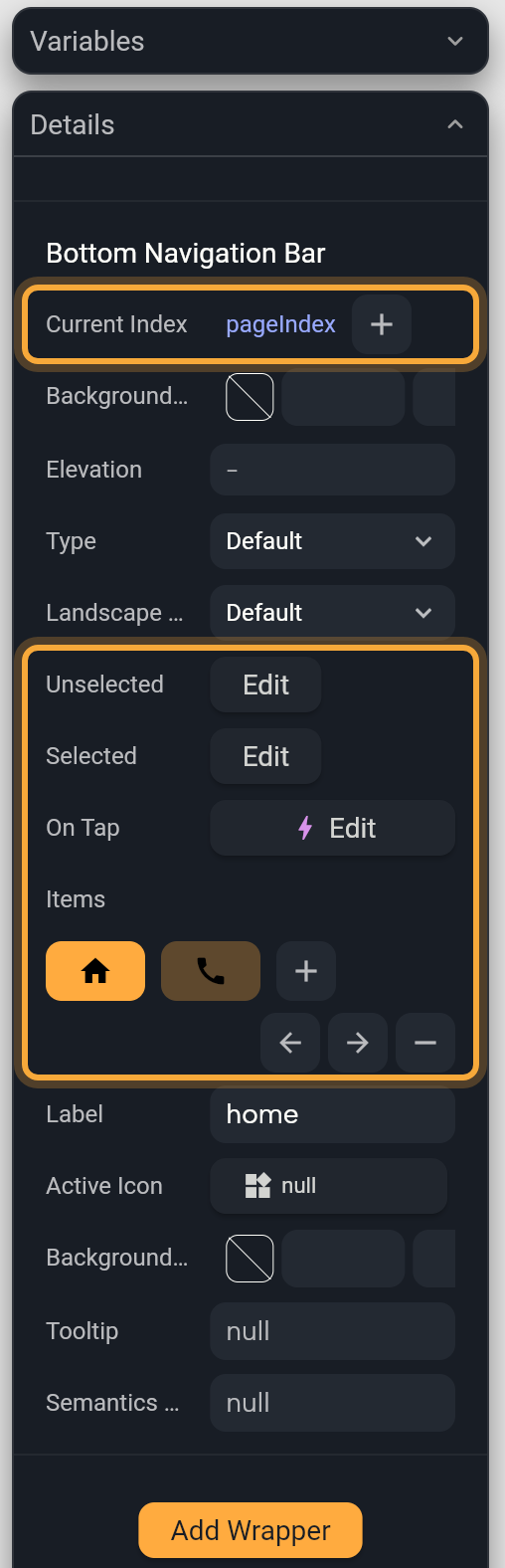
- Set a Bottom Navigation Bar in the screen's slot, as in Add a screen part. It starts with two tabs, "home" and "call".
- Select the bar in the Outline, under the
bottomNavigationBarslot. Current Index reads 0 and On Tap is empty, so the tabs don't switch yet. The next two steps connect them. - Click the Current Index label and choose Create Variable.... Nowa adds a whole-number variable and links Current Index to it. Open Variables and select the new variable. In Details, change its Name to
pageIndexand type0in Default Value, which starts empty. - Select the bar again and click + next to On Tap. In Circuit, set
pageIndextovalue, the number of the tapped tab, and add refresh, which redraws the screen with the new tab. See Change a variable from logic. In Play, tapping a tab now selects it. - Under Items, click a tab to select it and change its Label. To change its icon, select the tab's Icon under the bar in the Outline and click the icon field in Details (see Choose an icon). Click + to copy the last tab. The arrow buttons move the selected tab left or right, and the remove button deletes it. A bar needs at least two tabs, so with two left the remove button does nothing.
- Click Edit next to Unselected or Selected to set that state's Color, Show label and style.
Removing the bar removes pageIndex too, so anything linked to it needs a new value.
The bar itself only shows which tab is selected. To show a different page for each tab, use an Indexed Stack in the body. To open a different screen when a tab is tapped instead, add a navigation step to On Tap: see Navigate between screens.
Switch what a screen shows
These widgets show one piece of content at a time.
| Widget | People switch by | Good for |
|---|---|---|
| Indexed Stack | Whatever you link to Index, such as a bottom navigation bar | The pages behind a bottom navigation bar |
| Page View | Swiping sideways | Onboarding steps, photo galleries |
| TabView | Tapping a tab | Sections on one screen |
| Cross Fade | A value your logic changes | Swapping two states in place |
Show a page for each tab
An Indexed Stack holds all your tab pages but shows only one. Each hidden page keeps its state, such as how far someone scrolled or what they typed, so switching back feels instant.
- Add an Indexed Stack to the screen body. Make it fill the space above the bar: see Lay out widgets.
- Under Children, click + for each tab. Replace each placeholder with a widget, usually a component: click it and pick from the list.
- Click the Index label, open LOCALS and pick
pageIndex. - Press Play and tap the tabs.
The first child shows when pageIndex is 0, the second when it is 1, and so on. To design another page on the board, change the Default Value of pageIndex in Variables, and set it back afterwards.
Swipe between pages
A Page View shows one page at a time, and people swipe sideways to the next, like the welcome steps of a new app.
- Add a Page View. It starts with two pages and a row of dots near the bottom.
- In the Outline, select the PageView. Under Children, click + to add a page, then replace each page's widget.
- In the Outline, select the dots: the AnimatedSmoothIndicator next to the PageView. Clicking the dots on the board selects the Stack around them instead. Set Count to the number of pages.
- Click + next to Effect, then choose a style with Effect type. Effect has no + until your project has the package (see below).
- To make the dots follow the pages, create a whole-number variable, link the dots' Active Index to it, and open the Page View's On Page Changed. Set the variable to
valueand add refresh. See Store data in variables.
The dots are a separate widget. Nowa doesn't connect them to the pages for you, which is why step 5 matters.
The dots need the smooth_page_indicator package, a ready-made add-on that draws them, and Nowa doesn't ask about it when you add a Page View. Without it, the dots still draw on the board and Problems shows one error: 'smooth_page_indicator' is imported but is not in the pubspec. That means the package isn't in your project yet.
To add it, click Fix next to that message in Problems, or select the dots and click Hot Fix under Dependencies in Details. If you open a project that already uses the dots without the package, Nowa offers a Page indicator migration: see Handle the Page indicator migration.
Add tabs
A TabView puts sections side by side under a row of tabs, such as Ingredients and Steps on a recipe screen.
- Add a TabView. It starts with two tabs, "Tab1" and "Tab2", and a text page for each.
- In the Outline, select the TabBar. Under Tabs, click + to add a tab and edit its text.
- Select the TabBarView. Under Children, click + to add a page.
- Select the TabView's top row in the Outline, open the TabView Controller section in Details and set Length to the number of tabs.
Keep the three numbers equal: Length, the tabs and the pages. Nowa doesn't keep them in step for you, and your app shows an error when they differ. Is Scrollable on the TabBar helps when there are many tabs.
Fade between two widgets
A Cross Fade swaps one widget for another with a soft fade, such as a "Follow" button that turns into "Following".
- Add a Cross Fade. It starts with two placeholder boxes. The Outline can show it as
AnimatedCrossFade. - Click First Child and Second Child in Details and pick a widget for each.
- Set Duration, how long the fade takes. It starts at 200 milliseconds.
- To switch while the app runs, click the Cross Fade State label, choose Create Variable..., and change that variable from an event. See Store data in variables.
Try "Add a bottom navigation bar with Home, Search and Profile tabs, and show a different page for each tab." See How Nowa AI works.
Next steps
- Navigate between screens to open other screens from a tap.
- Create and set up screens for the rest of a screen's settings.
- Widget catalog for every built-in widget.