Widget catalog
Nowa comes with 45 ready-made widgets, from a plain Container to a Google map. This page lists every one: what it's for, the settings worth knowing, and where to go for the ones that need more setup.
Find a widget in the Library
- Press Ctrl/Cmd + K with a board open, or click Widget in the toolbar. The Library opens with its search ready. Type part of a name, check the highlighted result and press Enter. Add widgets has the full steps, including drag and drop.
- The widgets on this page are under Built-in, in groups such as Basic, Buttons and Layout, and the tables below use the same groups. Your own screens and components are under Project. Filter limits the list to one kind of thing. Its default, Widgets, shows screens, components and widgets.
- Missing a widget? The Library has no request link. Open the widget picker dialog instead (select an empty container and click +, for example), click Request a Widget in its search bar, describe it and click Submit Request.
Nine widgets need a package, a ready-made add-on that gives your app an extra ability: SVG, Swipeable Stack, YouTube Player, Lottie, Rive, Pin Code Field, Admob Banner, Google Maps and RevenueCat Paywall. If your project doesn't have the package yet, Nowa opens Add Missing Dependencies when you add one with Enter or Insert. Click Add and Nowa installs the package and places the widget. See Add a widget that needs a package. The Html widget and the dots of a Page View need one too, but Nowa doesn't ask: their rows below say what to do.
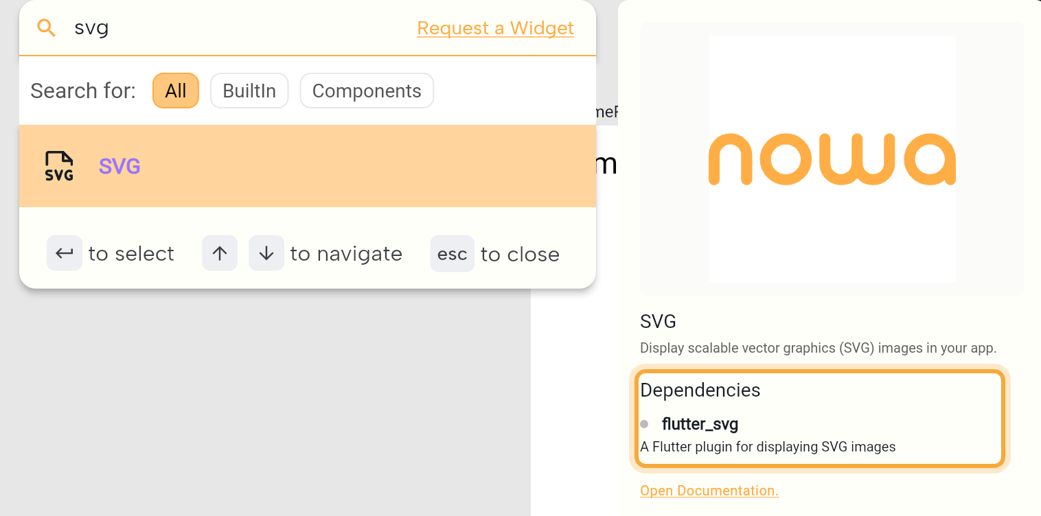
The Library's details card shows a preview, the name and the first lines of the description, but no Dependencies list or Open Documentation link. The picture above is the widget picker dialog, which has both.
Basic
| Widget | What it does | Good to know |
|---|---|---|
| Container | A box you can fill with a color, a gradient or a picture, and give a border, rounded corners and a shadow. Use it for cards, banners and colored backgrounds, such as a circle behind an icon. | Holds one widget: see Put a widget inside a container. The Shape tool draws one. Also a wrapper. Settings below. |
| Text | Text in a single style. | Type $ in the text to insert a variable: see Expressions and conditions. Settings below. |
| Text Field | A box where people type. | Nowa creates a variable, such as text, that holds what people type, and links it to Controller. You can add validators to check the input. |
| Icon | One icon from the Material icon set. | Pick the icon, Size and Color in Details: see Fonts and icons. Semantic Label, under Show advanced options, is what screen readers say for it. |
| SizedBox | An empty box of a fixed size, for spacing or to reserve room. | Earlier docs called it Empty widget. |
Container settings
| Setting | What it does |
|---|---|
| Color | The fill. The color picker also offers gradients: Linear, Radial and Sweep. The row hides while a picture is set. |
| Border | Hover the row and click + to add one. It starts black and 1 wide; change its Color and Width. |
| Radius | Rounds the corners. Hover the row, click + and type a number. The button next to the number sets each corner on its own (TL, TR, BL, BR). |
| Image | A picture that fills the box: see Use a picture as a background. |
| Shadows | A shadow that lifts the box off the screen. Hover and click + to add one; you can stack several. |
| Alignment, Padding, Margin | Where the widget inside sits, the space inside the box, and the space around it. |
Text settings
A new text grows with its words: its size in Layout is Auto. To draw a box of your own size instead, drag while you place it with the Text tool.
| Setting | What it does |
|---|---|
| Text | The words. Double-click the text on the board to edit it in place. |
| Text Align | Four buttons: left, center, right and justify (both edges straight). |
| Overflow | What happens to text that doesn't fit: ellipsis ends it with "…", fade fades it out, clip cuts it off and visible lets it spill over. Default removes your choice. |
| Style | Font, weight, size, color, letter spacing, line height and shadows. A new text follows your theme. To change one text only, click the Style label and choose CopyWith (Modify Style while it uses the default style): see Use a theme text style. |
Images
| Widget | What it does | Good to know |
|---|---|---|
| Image | A picture from a web address, from your project's assets or from bytes. | Choose Network, Asset or Bytes. On Asset, Pick Image chooses a file or uploads one. Fit sets how it fills its box: see Choose how a picture fits its box. |
| SVG | A vector image (.svg) that stays sharp at any size, from the web or from a file you upload. | Needs a package. Use Pick SVG on the Asset tab (.svg files only). |
Buttons
| Widget | What it does | Good to know |
|---|---|---|
| Button | A button that runs an action when pressed, such as Save, Sign in or Add to cart. | Its label is a Text widget inside it: select that to change the words or their style. Click Edit next to On Pressed to build the action: see Respond to taps and other events. On Hover runs when a mouse pointer moves onto or off it, on the web and desktop. |
| Icon Button | A tap target that shows only an icon, such as a heart or a share icon. | Same events as Button: On Pressed, On Long Press and On Hover. |
| Floating Button | A round button that floats above a screen's content, for its main action, such as adding a task. | Set it in the screen's Floating Action Button slot: see Add a screen part. |
Layout
| Widget | What it does | Good to know |
|---|---|---|
| Group | Arranges widgets stacked on top of each other (Stack), side by side (Row) or top to bottom (Column). | Starts as an empty Stack. Switch the arrangement in Details. |
| TabView | Tabs, with a page for each. | Starts with two tabs, "Tab1" and "Tab2". |
| List View | A scrolling list: Builder repeats one item for each entry of a list, Normal holds widgets you add yourself. | Starts in Builder with three placeholder items. Click Connect next to List to use a list variable. |
| Grid View | A scrolling grid with the same Builder and Normal choice. | Starts in Builder with two columns and three placeholder items. |
| Swipeable Stack | A deck of cards that people swipe away. | Needs a package, and creates a swiperController variable that buttons can use to swipe. The board draws at most two cards. |
| Page View | Pages that people swipe between, one at a time, with a row of dots at the bottom. | The dots are a separate widget on top of the pages: click + next to Effect, then choose their style with Effect type. They need a package, which you add with one click: see Swipe between pages. |
| Indexed Stack | Widgets on top of each other, where only the one at Index shows. The hidden ones keep their state. | Link Index to a variable to switch content, for example the pageIndex of a Bottom Navigation Bar. |
| Cross Fade | Fades between two widgets, First Child and Second Child. | Cross Fade State picks which one shows. Duration sets the fade time. |
| Wrap | Lays widgets out in a row (or column) and continues on a new line when it runs out of room, like a set of tags. | Set the gaps with Spacing and Run Spacing. See Lay out widgets. |
| Data Builder | Loads data and builds the widgets inside it from the result, with loading and error states. | Pick a Source: API Request, Supabase or Firestore. Also a wrapper, which keeps the widget you already built. |
Players
| Widget | What it does | Good to know |
|---|---|---|
| Video Player | Plays a video from a web address or from a file you upload, with player controls. | Use Pick Video on the Asset tab for a file. The board shows a placeholder, not the video. |
| YouTube Player | Plays a YouTube video inside your app. | Needs a package. Type the video's ID in Initial Video Id. The board shows the video's thumbnail and title. |
Animations
| Widget | What it does | Good to know |
|---|---|---|
| Lottie | Plays a Lottie animation from the web or from a file you upload. | Needs a package. Use Pick Lottie on the Asset tab (.json files only). |
| Rive | Plays a Rive animation. | Needs a package. Use Pick Rive on the Asset tab (.riv files only), then choose an Artboard and a State Machine. |
| AnimatedContainer | A container that animates when its properties change, such as a box that smoothly grows or changes color. | Starts with a 300 ms Duration. Also a wrapper. |
Progress indicators
| Widget | What it does | Good to know |
|---|---|---|
| Circular Progress Indicator | A spinning ring that shows something is loading, such as while a screen fetches data or a form is sent. | Spins until you set Value, a number from 0 to 1 (0.4 shows 40%). Color, Background Color (the track behind it) and Stroke Width (its thickness) change its look. Semantics Label and Semantics Value tell screen readers what's loading and how far along it is. |
| Linear Progress Indicator | A loading bar. | Works like the circular one: set Value (0 to 1) to show a fixed amount. Min Height sets its thickness and Border Radius rounds its ends. |
Forms
| Widget | What it does | Good to know |
|---|---|---|
| Checkbox | A tick box, for choices such as "Remember me". | Value is its state. On Changed runs when someone taps it. Colors, a third state and more: see Use checkboxes, switches and sliders. |
| Switch | An on/off switch, for settings such as notifications. | Value is its state. On Changed runs when someone flips it. |
| Popup Menu Button | A button that opens a small menu. | Starts with one item, "Item 1". On Selected runs when someone picks an item. See Add a popup menu. |
| Dropdown menu | A dropdown for choosing one option from a list. | Starts with one option, "first". Add more under Items. |
| Slider | A slider for choosing a number between Min and Max. | On Changed runs as the thumb moves. Divisions makes it move in steps. |
| Pin Code Field | Boxes for typing a short one-time code (OTP). | Needs a package, and creates a pinCode variable that holds the code. Pin Code Length goes up to 6. |
Screen components
| Widget | What it does | Good to know |
|---|---|---|
| App Bar | The bar at the top of a screen, with a title and actions. | Set it in the screen's App Bar slot: see Add a screen part. |
| Bottom Navigation Bar | A row of tabs at the bottom of a screen. | Set it in the screen's Bottom Navigation Bar slot, then link Current Index to a variable and set that variable in On Tap: see Add a bottom navigation bar. |
| Drawer | A side menu that slides in over a screen. | Set it in the screen's Drawer slot: see Add a screen part. Also a wrapper. |
| List Tile | One row with a title and optional leading, subtitle and trailing widgets. | Typically the item of a List View or a row in a drawer. On Tap makes the row tappable. See Build rows with List Tile. |
| Expansion Tile | A tile that expands to show more widgets, like a FAQ question that reveals its answer. | Put the hidden widgets in Children. Initially Expanded opens it from the start. See Show more on tap with Expansion Tile. |
| Alert Dialog | A pop-up box with a title, content and action buttons, to confirm an action ("Delete this photo?") or share something important. | To show it in a running app, add a showDialog step, the logic step that opens a dialog: see Show dialogs, sheets, snackbars and pickers. To reuse your own design, make it a component and pick it as the dialog's content: see Use your own design. |
Integrations
| Widget | What it does | Good to know |
|---|---|---|
| Admob Banner | A banner ad, so your app can earn money from ads. | Needs a package and your App IDs in Settings (AdMob, under Integrations). Test ads are on by default. |
| Web View | A web page inside your app. | Nowa adds https:// if you leave it out. The board shows a placeholder: run your app to see the page. |
| Html | Formatted text written in HTML, such as an article from your blog. | Type or paste your HTML in Data. Needs a package, which you add with one click: see Show HTML. |
| Markdown | Formatted text written in Markdown. | Type or paste your Markdown in Data. People can select the text unless you turn Selectable off. |
| Google Maps | An interactive map with markers, polygons and custom styling. | Needs a package and your Google API keys (codes that let your app use Google's maps) in Settings (Google Maps, under Integrations). The board shows a placeholder: run your app to see the map. |
| RevenueCat Paywall | A ready-made paywall screen for in-app purchases and subscriptions. | Needs packages and your RevenueCat keys in Settings (RevenueCat, under Integrations). The board shows a placeholder. |
Not sure which widget you need? Try "Add a card with a photo, a title and a Buy button." Nowa AI picks the widgets for you, and you can still adjust them on the board.
Next steps
- Add widgets from the Library, the toolbar, drag and drop, or paste.
- Change widget properties in Details.
- Wrappers add padding, taps, scrolling and more around a widget.
- Lay out widgets with groups, rows and columns.