Show dialogs, sheets, snackbars and pickers
Popups are how your app talks with people while they use it: a quick "Saved" message, an "Are you sure?" question, a sheet that slides up with options, or a picker for a date, a time or a photo. You add each one as a step in Circuit.
A popup appears on top of a screen, so add it to a screen's or a component's logic, usually a button's On Pressed. Many popup steps have a Context input. It tells the popup which screen to appear on, and Nowa fills it in for you.
Show a snackbar
A snackbar is a short message that slides up at the bottom of the screen and goes away by itself. It's perfect for quick feedback that needs no answer, such as "Settings saved", "Item deleted" or "Couldn't save your changes".
- In Circuit, click a + and choose GLOBALS → Show snackbar.
- In Details, click the brush next to Content and change the text, which starts as "Hello World". Type
$to put a value inside it, such asDeleted ${item.name}. See Put a value inside text. - Click Play on the screen and tap the button to see it.
You can style the bar and change how it behaves:
| Option | What it does |
|---|---|
| Background Color | The bar's color. |
| Elevation | The size of its shadow. |
| Shape | Its outline, such as rounded corners. |
| Action | One button on the bar, such as Undo after a delete. It's under Show advanced options. With an action, the bar no longer goes away by itself: it stays until someone taps the button or swipes the bar down. |
| Duration | How long a bar without an action stays. It's 4 seconds unless you change it. Also under Show advanced options. |
| Padding, On Visible | Space inside the bar, and logic that runs once it's visible. Also advanced. |
| Width, Margin | Leave these empty. They only work on a floating snackbar, which this step doesn't offer. |
Use what the person chose
Dialogs, sheets and pickers wait for the person to choose something, and your next steps usually need that answer: the date they picked, or whether they tapped Delete. The answer arrives a moment later, so tell the popup's step how to receive it:
- Turn on await, then set Store result to New Variable. The steps below wait until the person answers, and the variable holds what they chose. This is the easiest way to use the answer right away.
- Or click + next to onValue. Your other steps carry on at once, and a separate function runs when the answer arrives, with the answer as
value.
If the person closes the popup without choosing, there's no answer, so the variable or value is empty (null). When your next steps need the answer, put them in the True branch of an If: click its Condition label, choose Custom Expression... and type var1 != null (with your variable's name), which means "there's an answer". Wait for a result has more on both options.
Show a dialog
A dialog is a box in the middle of the screen that asks for attention. Use it to confirm an action ("Delete this recipe?"), show a warning or an error, ask for a quick choice, or show something like your terms.
- In Circuit, click a + and choose MATERIAL →
showDialog. Its content starts as an AlertDialog, a ready-made dialog with room for a title, a message and buttons. At first it has only the title "Hello World". - Click the brush next to it (tooltip Edit AlertDialog) to change the title, the content and the buttons. For example, click the brush next to Title and type your own title.
- Click Play and tap the button to try it.
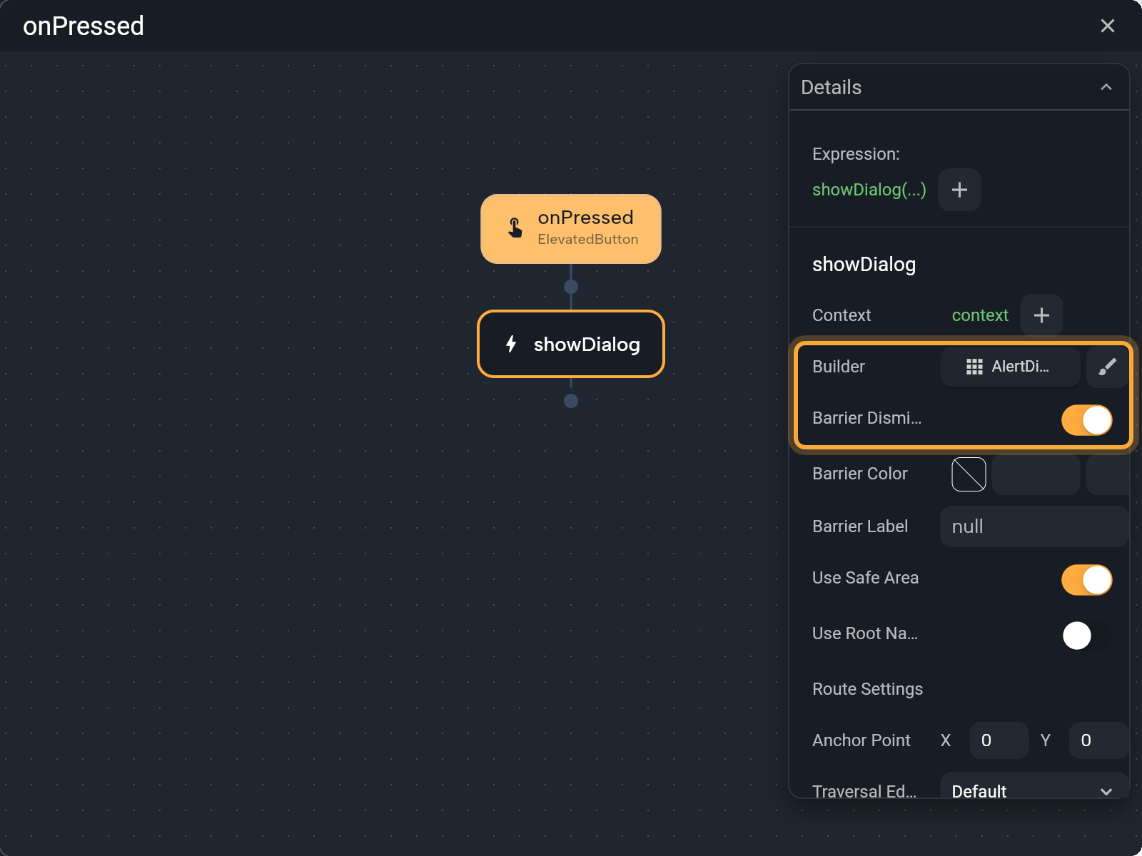
A few options matter most:
- Barrier Dismissible is on by default: tapping outside closes the dialog. Turn it off when the person must pick one of your buttons.
- Barrier Color sets the color that dims the screen behind the dialog.
- Barrier Label is what screen readers say for that dimmed area, for people who use one.
- Use Safe Area is on by default and keeps the dialog clear of notches and system bars.
- Use Root Navigator, Route Settings, Anchor Point and Traversal Edge Behavior are advanced. You can leave them as they are.
Use your own design
When the ready-made AlertDialog isn't enough, design the dialog on the board like any other widget, then reuse it wherever you need it.
- Add an Alert Dialog from the Library to a board and design it: add an icon, a picture, text and buttons.
- Right-click it, choose Create component and give it a name, such as
ConfirmDialog. See Build reusable components. - In the
showDialogstep, click the AlertDialog button in the Builder row, choose Pick Widget and pick your component.
The same menu has Edit in circuit, which opens the dialog's content as a function in Circuit, if you'd rather build it with logic.
Get an answer from a dialog
- Add buttons to the dialog's Actions, such as Cancel and Delete. In each button's On Pressed, add a Navigator step (under GLOBALS) and set its Type to
pop, which closes the dialog. Then set result type and result, the answer that button gives: for example, result typebool(a yes/no answer) with result turned on for "yes". See Navigate between screens. - On the
showDialogstep, turn on await and set Store result to New Variable, or use onValue. See Use what the person chose.
Example: confirm before deleting
Say your recipe screen has a Delete button. Asking first keeps people from deleting a recipe by accident.
- In the Delete button's On Pressed, add
showDialogand set the AlertDialog's title to "Delete this recipe?". - Give the dialog a Cancel and a Delete button, as in Get an answer from a dialog. Both use result type
bool: turn result on for Delete and leave it off for Cancel. - On the
showDialogstep, turn on await, set Store result to New Variable and rename the variableconfirmed. - Below it, choose Add If statement. Click its Condition label, open OPERATORS and choose
equal, which checks whether two values are the same. Click the formula the Condition now shows. Keep Type asbool, link Left side toconfirmedunder LOCALS and turn Right side on. The condition now means "the person tapped Delete". - In the True branch, add the steps that delete the recipe, then a snackbar such as "Recipe deleted".
If the person taps Cancel or outside the dialog, confirmed isn't true, so nothing gets deleted.
Show a bottom sheet
A bottom sheet slides up from the bottom edge and holds content you design. There are two kinds:
showModalBottomSheet(MATERIAL) sits over the screen and blocks it until the sheet is closed: tapping outside or dragging it down closes it. Use it for a short list of choices or a small form, such as "Edit, Share, Delete" or a set of filters. It starts with a centered text, "Bottom Sheet Opened", and a minimum height of 400. Edit it like a dialog. Extra options include Background Color, Is Scroll Controlled, Is Dismissible, Enable Drag, Show Drag Handle and Constraints. It can send an answer back, like a dialog.showBottomSheet(MATERIAL) stays at the bottom while people keep using the screen. Use it for extra information that sits next to your content. Choose its content in the Builder row. Start it from the logic of a component placed on a screen: when your app runs, a screen's own logic can't open it and stops with an error, so useshowModalBottomSheetthere.
Pick a date or time
A date picker shows a calendar so people can choose a day, and a time picker lets them choose a time. Think of booking a table, a task's due date, a birthday or a delivery slot.
- In Circuit, click a + and choose MATERIAL →
showDatePicker. - Set the range people can choose from with First Date and Last Date. Initial Date is the day the calendar opens on. All three start as today, so until you change them, people can only pick today. To set a fixed day, click the date's label, choose Custom Expression... and type the year, month and day, such as
DateTime(2030, 12, 31). - Turn on await and set Store result to New Variable. The variable holds the chosen date, or nothing if the picker was closed.
To match your app's words or language, Help Text changes the title at the top of the picker, and Cancel Text and Confirm Text change its buttons.
Example: pick a date and show it
Say a booking screen has a text that should show the chosen day, and a Pick a date button under it.
- Select the text widget, click its Text label in Details and choose Create Variable.... Nowa links the text to a new variable: rename it
dateText. See Store data in variables. - In the button's On Pressed, add
showDatePickerwith your range, turn on await, store the result in a new variable and rename itpickedDate. - Add a node: open LOCALS and pick
pickedDate. In Details, click the + after it, chooseformatand pick a style in the .format dropdown, such asYEAR_MONTH_DAY. - Set Store result to Pick Variable and choose
dateText. - Add LOCALS → refresh below it, so the screen shows the new text.
- Click Play, tap the button and pick a day. The text now reads something like "April 10, 2025".
If someone closes the picker, there's no date, and the format step stops with an error. To skip steps 3 to 5 in that case, put them in an If that checks pickedDate != null, as in Use what the person chose. The text then keeps showing what it showed before.
Show a date as text
The format step turns a date into text in the style you pick. Here's how each style looks in US English, for Thursday, April 10, 2025 at 5:30:15 PM:
| To show | Styles in the .format dropdown |
|---|---|
| The full date | YEAR_MONTH_DAY April 10, 2025 · YEAR_ABBR_MONTH_DAY Apr 10, 2025 · YEAR_NUM_MONTH_DAY 4/10/2025 |
| The date with the weekday | YEAR_MONTH_WEEKDAY_DAY Thursday, April 10, 2025 · YEAR_ABBR_MONTH_WEEKDAY_DAY Thu, Apr 10, 2025 · YEAR_NUM_MONTH_WEEKDAY_DAY Thu, 4/10/2025 |
| Day and month | MONTH_DAY April 10 · ABBR_MONTH_DAY Apr 10 · NUM_MONTH_DAY 4/10 · MONTH_WEEKDAY_DAY Thursday, April 10 · ABBR_MONTH_WEEKDAY_DAY Thu, Apr 10 · NUM_MONTH_WEEKDAY_DAY Thu, 4/10 |
| Month and year | YEAR_MONTH April 2025 · YEAR_ABBR_MONTH Apr 2025 · YEAR_NUM_MONTH 4/2025 |
| One part | YEAR 2025 · MONTH or STANDALONE_MONTH April · ABBR_MONTH or ABBR_STANDALONE_MONTH Apr · NUM_MONTH 4 · DAY 10 · WEEKDAY Thursday · ABBR_WEEKDAY Thu |
| The quarter | QUARTER 2nd quarter · ABBR_QUARTER Q2 · YEAR_QUARTER 2nd quarter 2025 · YEAR_ABBR_QUARTER Q2 2025 |
| The time, 12-hour clock | HOUR_MINUTE 5:30 PM · HOUR_MINUTE_SECOND 5:30:15 PM · HOUR 5 PM |
| The time, 24-hour clock | HOUR24_MINUTE 17:30 · HOUR24_MINUTE_SECOND 17:30:15 · HOUR24 17 |
| Minutes and seconds | MINUTE 30 · SECOND 15 · MINUTE_SECOND 30:15 |
Pick a time
showTimePicker works the same way. Initial Time is the time it opens on: set its Hour and Minute, because it starts at 0:00 (midnight). Besides Help Text, Cancel Text and Confirm Text, you can change Hour Label Text and Minute Label Text, the words under the hour and minute when people type a time, and Error Invalid Text, the message for a time that isn't valid.
The result is a time. Click the + after it to use one of these:
formatturns it into text, such as 5:30 PM, or 17:30 on a phone set to 24-hour time. Nowa fills in its Context for you. To show the time, follow the date example above withshowTimePickerand thisformat.hour(0 to 23) andminutegive the numbers.hourOfPeriodis the hour on a 12-hour clock, andperiodtells you AM or PM.isBefore,isAfterandisAtSameTimeAscompare it with another time, for example to check that a pickup time is after your opening time.
Pick a date range
showDateRangePicker lets people pick a start and an end date, such as the nights of a hotel stay. Nowa fills First Date and Last Date with a placeholder date, so set both the same way as for a single date. The result has start and end.
Pick photos or videos
showMediaPicker lets people choose photos or videos from their gallery, or take a new one with the camera. Use it for a profile picture, photos of an item for sale or a picture of a receipt.
- In Circuit, click a + and choose NOWA_RUNTIME →
showMediaPicker, then set its options (see the table below). - If Dependencies shows missing items, click Hot Fix. It turns on the permissions your app needs for the camera and the photo library. See Fix missing permissions with Hot Fix.
- Turn on await and set Store result to New Variable. The variable holds a list of the picked files, even when there's only one, and the list is empty if nothing was picked.
| Option | What it does |
|---|---|
| Multi Selection | Off by default. Turn it on to pick several files. Limit then appears. |
| Media Type | image (the default), video or both. |
| Source Type | gallery, camera (the default) or both. With both, the app asks with a Choose Source sheet (Camera, Gallery, Cancel). It's fixed to gallery when Multi Selection is on or Media Type is both. |
| Max Duration | The longest video, for video. |
| Image Quality, Max Width, Max Height | Resize and compress images. |
| Preferred Camera | rear or front. Hidden when picking several files or both types. |
Example: show a photo the person picks
Say a profile screen has an image and a Change photo button.
- Select the image widget. In Details, open the Bytes tab of its image, click the Bytes label and choose Create Variable.... Rename the new variable
photo. Its type,Uint8List, means the raw data of an image. - In the button's On Pressed, add
showMediaPickerand set Source Type togallery. Turn on await and store the result in a new variable,var1. - Choose Add If statement. Click its Condition label, open LOCALS, pick
var1and chooseisNotEmpty, so the next steps only run when a photo was picked. - In the True branch, add a node: pick
var1under LOCALS, click + in Details and choosefirst(the first picked file), thenreadAsBytes(its image data). Turn on await, set Store result to Pick Variable and choosephoto. - Add LOCALS → refresh below it.
- Click Play, tap the button and choose an image. On your computer, the gallery opens a file picker, so you choose an image file.
Play on a computer can't use a camera, so test with gallery there, and try the camera when your app runs on a phone (see Run on a device or emulator). To upload the photo, see Store files in Supabase.
In Agent mode, try: "When the user taps Pick a date, open a date picker and show the chosen date in the text above the button." Then open the result in Circuit to see each step. See Chat with Nowa AI.
Next steps
- Navigate between screens to send people to another screen after a choice.
- Use ready-made actions for opening links, saving values on the device and more.
- Build logic in Circuit for await, onValue and Store result.