Linear Progress Indicator
Linear Progress Indicator
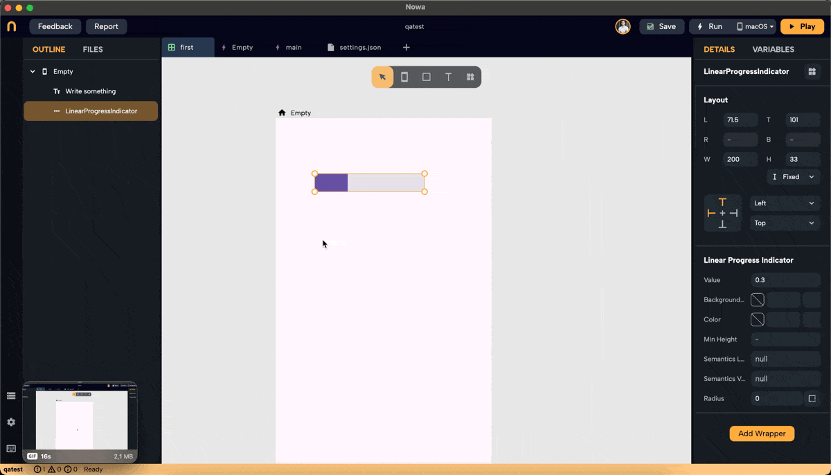
The Linear Progress Indicator widget allows you to visually represent the progress of a task or operation in a linear bar format. Below are the steps and customization options for using the Linear Progress Indicator in Nowa.
Steps to Add a Linear Progress Indicator
-
Add the Widget:
- Navigate to the widget panel and select the Linear Progress Indicator.
-
Position and Size:
- Adjust the position by dragging it, or by adjusting the values for Left (L), Top (T), Right (R), and Bottom (B).
- Set the Width (W) and Height (H) by dragging the sides, or by entering values for it in the details panel.
-
Alignment:
- Use the alignment tool to set the alignment of the Linear Progress Indicator. Options include Left, Center, Right, Top, and Bottom.
Customization Options
-
Value:
- Set the progress value, ranging from 0.0 to 1.0, where 0.0 represents no progress and 1.0 represents full progress.
-
Background Color:
- Choose a background color for the progress bar using the color picker or by entering a hex color code.
-
Color:
- Set the color of the progress indicator itself using the color picker or by entering a hex color code.
-
Minimum Height:
- Specify the minimum height of the progress bar to control its thickness.
-
Semantics:
- Semantics Label: Provide a label for accessibility purposes to describe the progress indicator.
- Semantics Value: Set a value for accessibility purposes to convey the progress level.
-
Radius:
- Set the border radius to control the roundness of the corners of the progress bar.
Example Configuration
- Value: 0.4 (Represents 40% progress)
- Background Color: Choose a color that complements your app's theme.
- Color: Select a color that stands out against the background color.
- Minimum Height: Adjust according to the desired thickness of the progress bar.
- Radius: Set a value to achieve the desired roundness of the corners.
Final Notes
Adjust the parameters to fit the design and functionality requirements of your application. The Linear Progress Indicator is a versatile widget that can be extensively customized to match your app's theme and provide effective visual feedback to users.