Expansion Tile
The Expansion Tile widget is used to create collapsible panels that expand to reveal additional content. It is perfect for displaying hierarchical or categorized data in a user-friendly way.
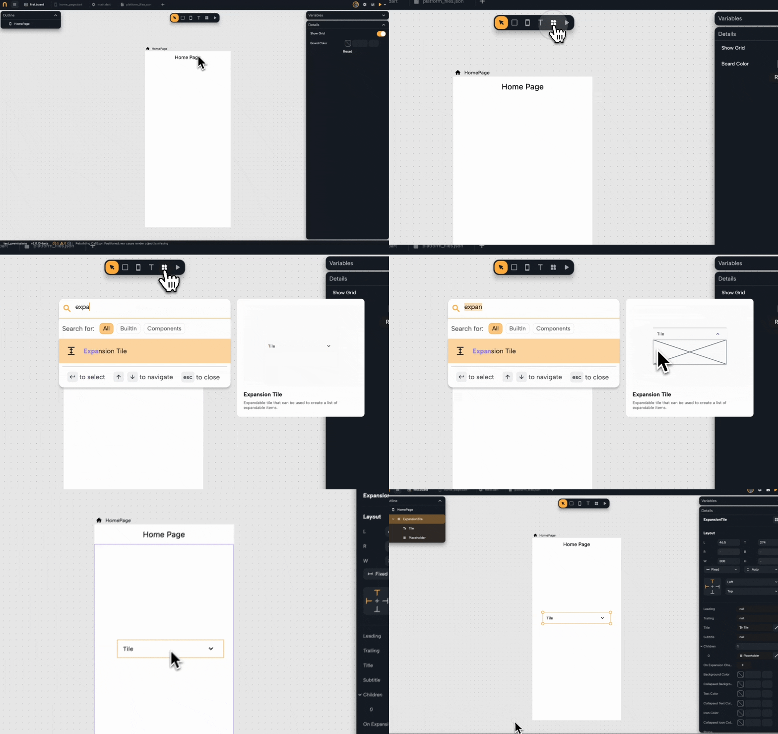
Add the Widget :
- Open the widget picker and search for "Expansion Tile."
- Select the Expansion Tile from the list.
- Drag and drop it onto your design canvas.

Customize and Design Your Expansion Tile
Main Properties Overview :
These properties define the primary visual and informational elements of the Expansion Tile.
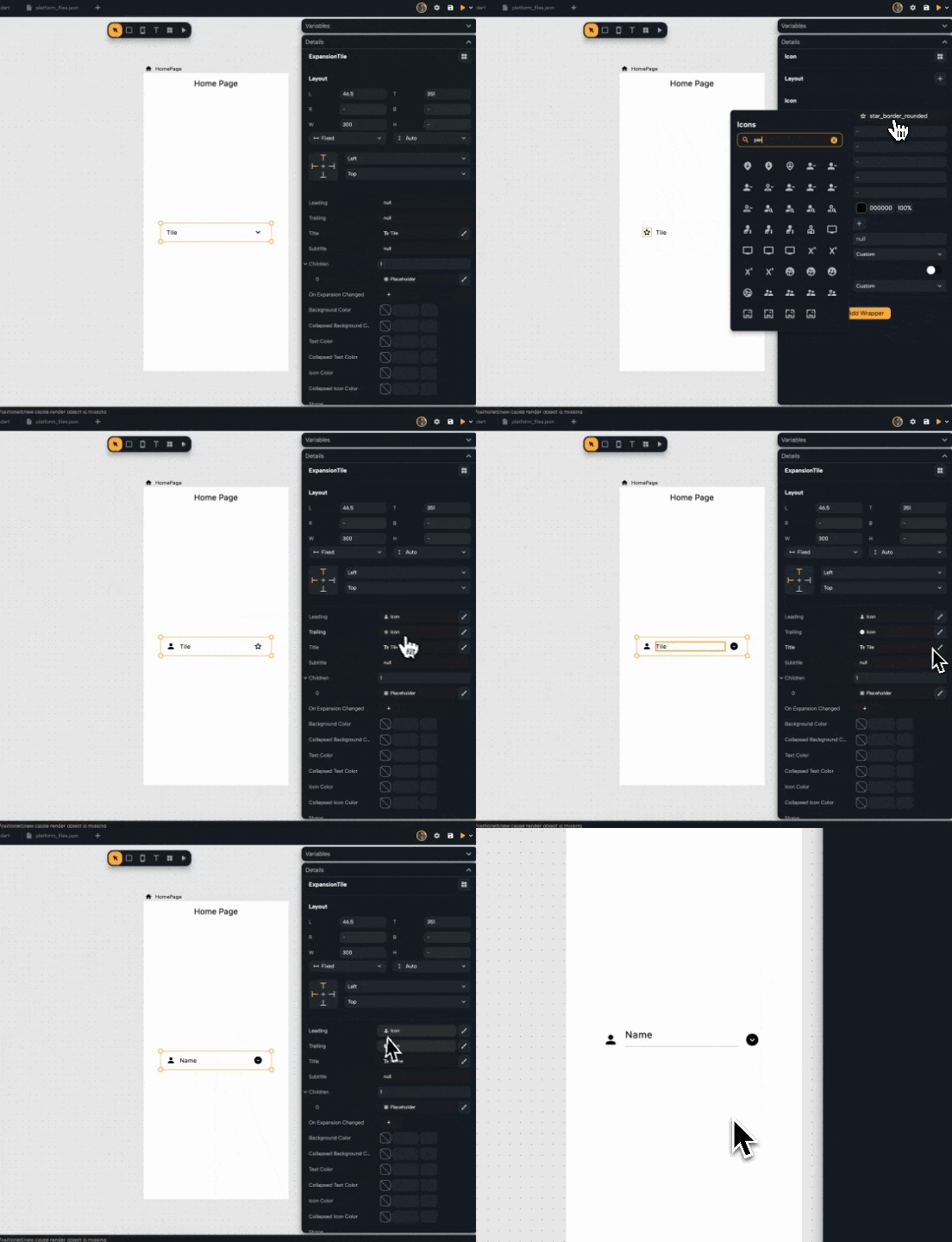
- Leading: Add an icon or widget to the left of the title for emphasis (e.g., an avatar or category icon).
- Trailing: Specify a trailing widget, commonly used to replace or hide the default expand/collapse icon.
- Title: The main text displayed when the tile is collapsed.
- Subtitle: An optional secondary text to provide additional information under the title.

Children :
The Children section contains widgets displayed when the Expansion Tile is expanded.
- Add Placeholder or Widgets: Click the + button to add child widgets such as text, images, buttons, or form fields.
- Manage Children: You can edit or remove widgets inside the children list as needed to organize content.

On Expansion Changed :
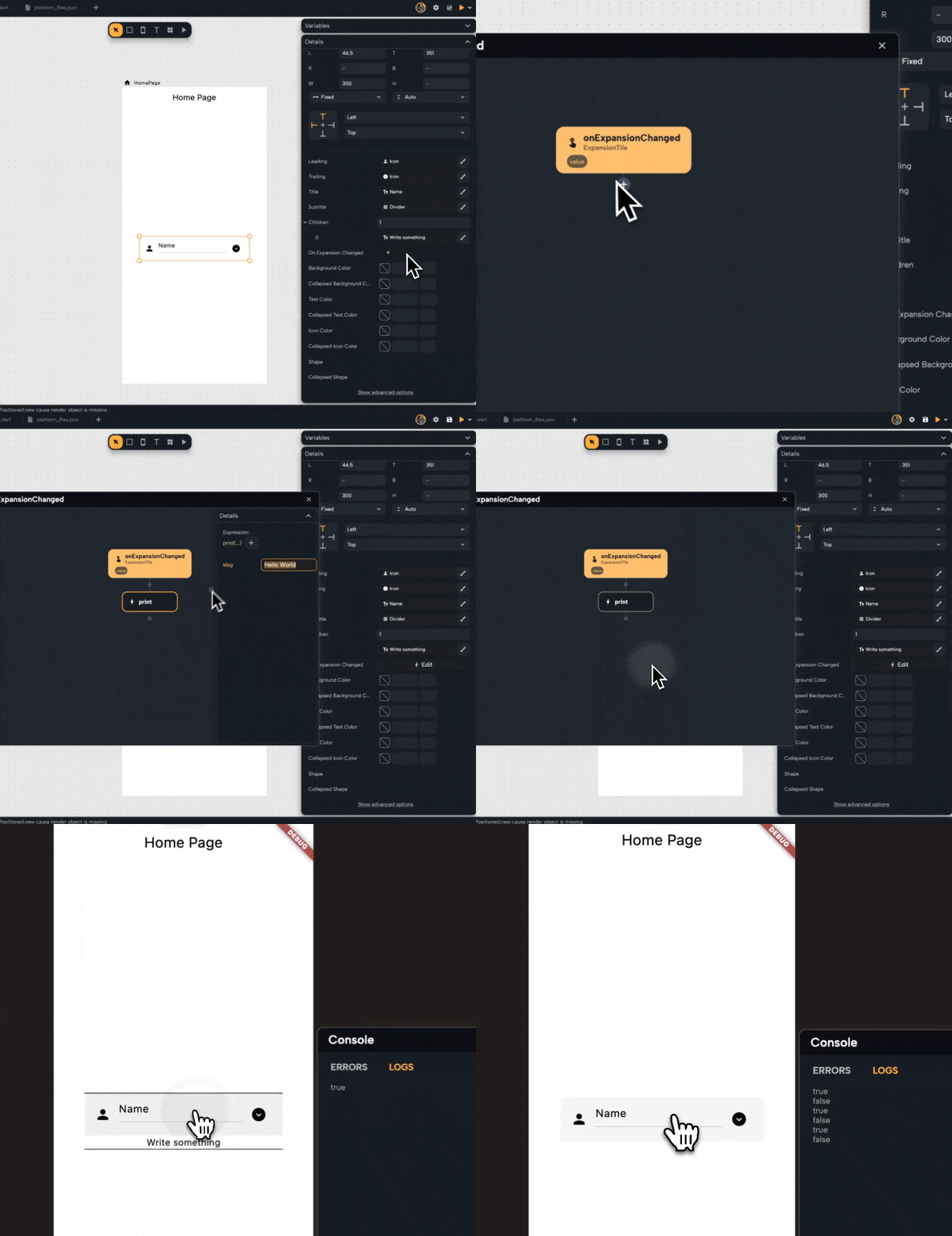
This property allows you to add an action when the Expansion Tile expands or collapses.
- Edit Event Logic: Click the Edit button to open the action editor and define logic for handling expansion changes.
- Use Case: For example, you can update a UI element, trigger analytics, or log events when users expand or collapse the tile.

Styles :
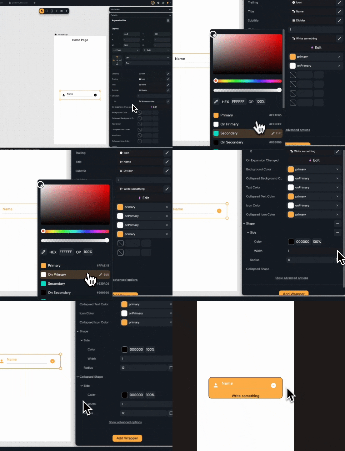
Customize the appearance of the Expansion Tile for both collapsed and expanded states:
- Background Color: The background color when the tile is expanded.
- Collapsed Background Color: The background color in the collapsed state.
- Text Color: The color of the title and subtitle in the expanded state.
- Collapsed Text Color: The color of the title and subtitle in the collapsed state.
- Icon Color: Color for the expansion icon in the expanded state.
- Collapsed Icon Color: Color for the expansion icon in the collapsed state.
- Shape: Define the border shape (e.g., rounded rectangle).
- Collapsed Shape: A separate shape configuration for the collapsed state.

Advanced Options
Expand this section to configure more detailed settings:
- Enabled: Toggle whether the Expansion Tile is interactive.
- Initially Expanded: Set whether the tile should be expanded by default.
- Show Trailing Icon: Toggle visibility of the default expand/collapse icon.
- Min Tile Height: Define the minimum height for the collapsed tile.
- Tile Padding: Adjust padding around the title and subtitle.
- Children Padding: Set the padding for the expanded children widgets.
- Expanded Alignment: Align the expanded content.
- Expansion Animation Style: Customize the animation curve for expanding and collapsing.
- Controller: Optionally control the expansion programmatically.
- Clip Behavior: Determine how the widget content is clipped (e.g., none, anti-alias).
- Control Affinity: Define how leading and trailing widgets are positioned.
- Maintain State: Keep the state of the tile consistent when navigating away and back.
- Dense: Enable a compact view for minimal padding.
- Visual Density: Adjust the density of the widget.
- Enable Feedback: Enable haptic or visual feedback when interacting with the tile.