Colors
Colors are a vital part of your app's design. With Nowa’s theme system, you can easily create and manage a cohesive color palette. Themes ensure your app looks consistent, professional, and adaptable to changes.
Color Properties in Themes
To customize theme colors, open the themes.dart file located in the globals folder. From there, click on Colors. You can modify any color property to align with your brand or style.
Each theme comes with a comprehensive set of color properties. These properties determine how widgets look across your app. Below is an explanation of each property:
- Primary: The main color for key elements like buttons and app bars.
- On Primary: The color of text and icons displayed on primary-colored backgrounds.
- Secondary: A complementary color for accents or secondary elements.
- On Secondary: The color of text and icons displayed on secondary-colored backgrounds.
- Tertiary: An additional accent color for unique or decorative elements.
- On Tertiary: The color of text and icons displayed on tertiary-colored backgrounds.
- Error: A strong color used to highlight errors or warnings.
- On Error: The color of text and icons displayed on error-colored backgrounds.
- Surface: The background color used for cards, sheets, and menus.
- On Surface: The color of text and icons displayed on surface-colored backgrounds.
- Shadow: The color used for shadows on elevated components like buttons or cards.
- Background: The overall background color of your app.
- On Background: The color of text and icons displayed on the app’s background.
This well-structured system ensures all design elements work together seamlessly, creating a cohesive user experience.
Changing Theme Colors
You can easily change any color in the theme to suit your needs.
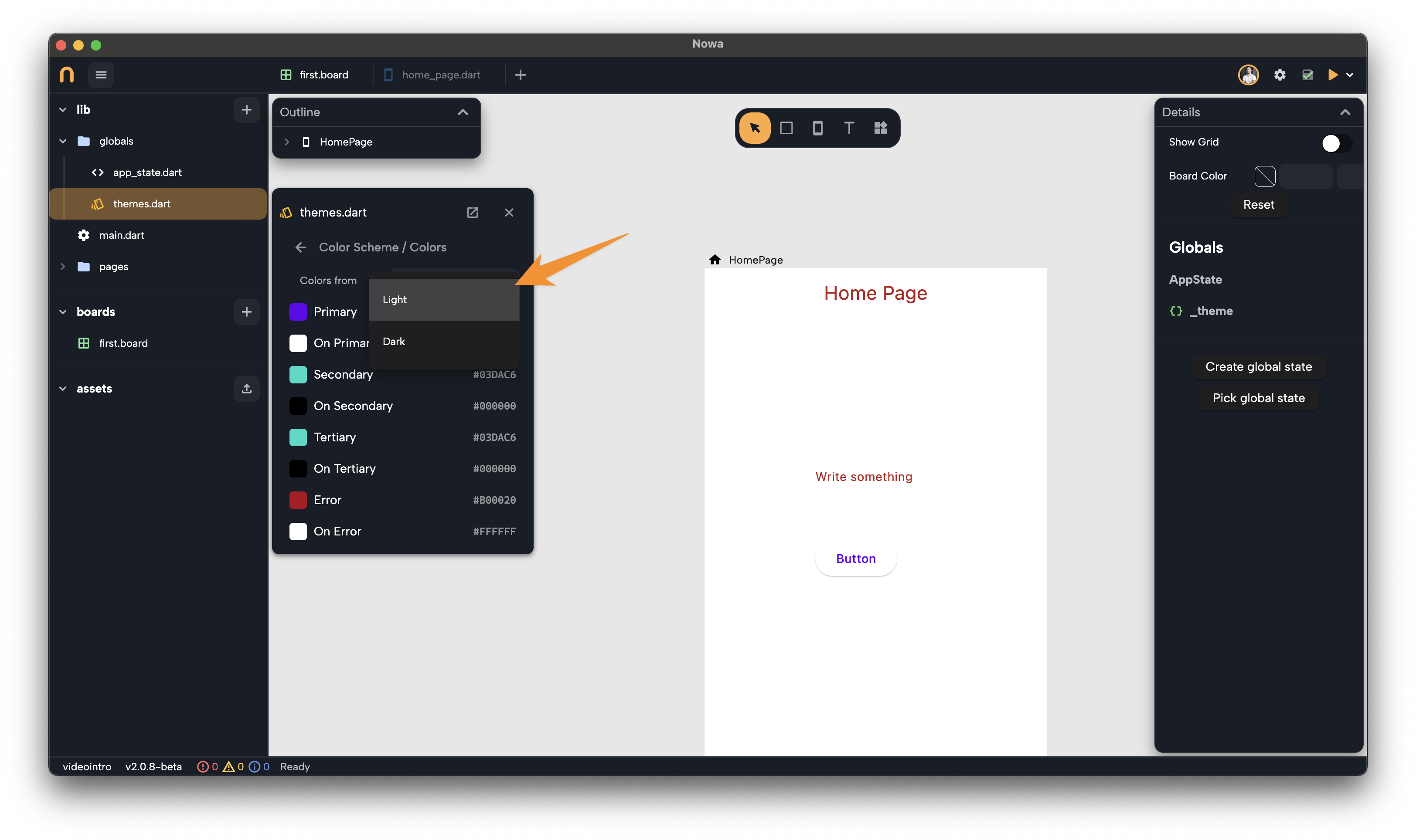
To start, use the Colors from menu to load the default Light or Dark mode colors.

Unchanged colors will automatically toggle between Light and Dark modes. Customized colors, however, remain fixed, giving you precise control over your app's appearance.
This approach is particularly useful when creating a new theme that isn’t based on the default Light or Dark modes.
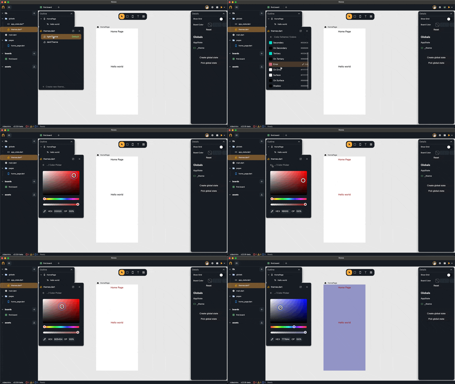
Changing one of the colors of the default theme updates your app UI instantly:

Using Theme Colors for Widgets
To apply a theme color to a widget:
- Open the color picker in the widget’s properties panel.
- Choose a theme color like
Primary,Secondary, orBackground.
Once a widget is linked to a theme color, it will automatically update whenever you modify the theme or that specific color. This ensures your app stays consistent and saves you from making manual updates.

Adding Opacity to Theme Colors
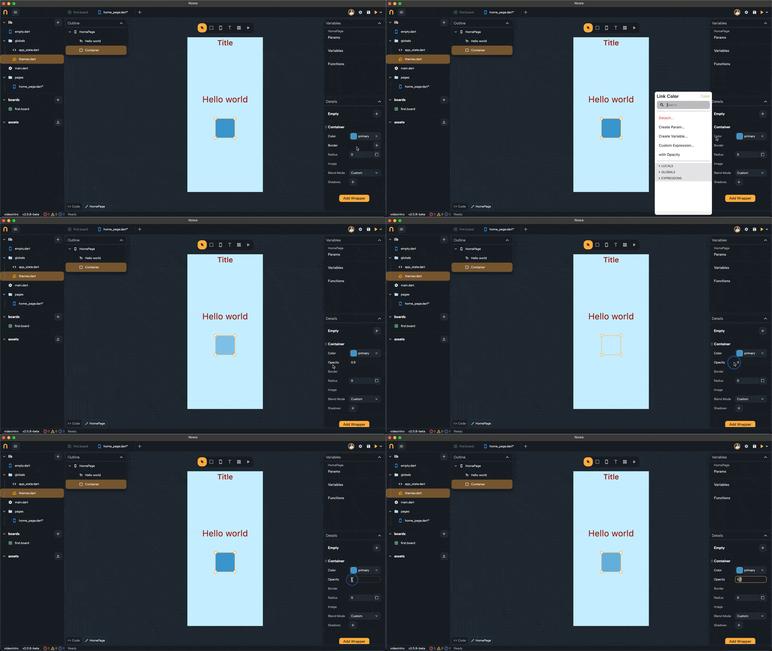
Need a transparent version of a theme color? Nowa makes it easy without altering the original color in the theme. Follow these steps:
- Link a widget to a theme color.
- Click on the color name in the properties panel.
- Select With Opacity and adjust the transparency level to your liking.
This feature is perfect for subtle effects while keeping the base color intact.

Default Theme Colors for New Widgets
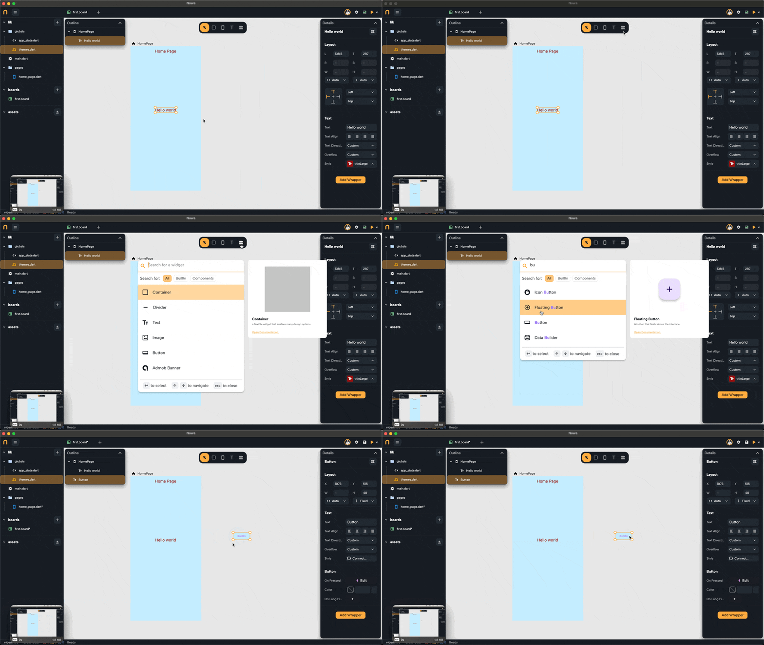
When you drop a new widget into your project, it will automatically use the colors from the default theme.
For example, when you add a button, it will inherit the current default theme's colors without requiring additional setup. This saves time and ensures new widgets blend seamlessly with your design.

Nowa’s theme colors empower you to create stunning, adaptable designs effortlessly. They provide flexibility, consistency, and efficiency, helping you focus on what matters most—building a beautiful app. Next, we’ll dive into Typography, which defines the structure and style of your app’s text.