Padding
The Padding Wrapper in Flutter is a fundamental and versatile widget that provides empty space to its child. By adding padding, you can ensure that content doesn't get rendered too close to the screen's edge or to another widget. Padding is an essential tool for creating visually appealing layouts.
When to use Padding?
- Improving Aesthetics: Padding can make your UI feel less cramped. Space allows content to breathe and can make your UI components distinct and readable.
- Touch Targets: On touch-screen devices, ensuring that touch targets (like buttons) are not too close together can improve user experience. Adding padding can prevent accidental taps.
- Visually Grouping: Padding can be used to group related widgets together visually.
- Aligning Widgets: When combined with other layout widgets, Padding can help align widgets in a desired way.
- Spacing Text: When text is rendered too close to an edge or another widget, it can become challenging to read. Padding helps in ensuring legibility.
How to add Padding
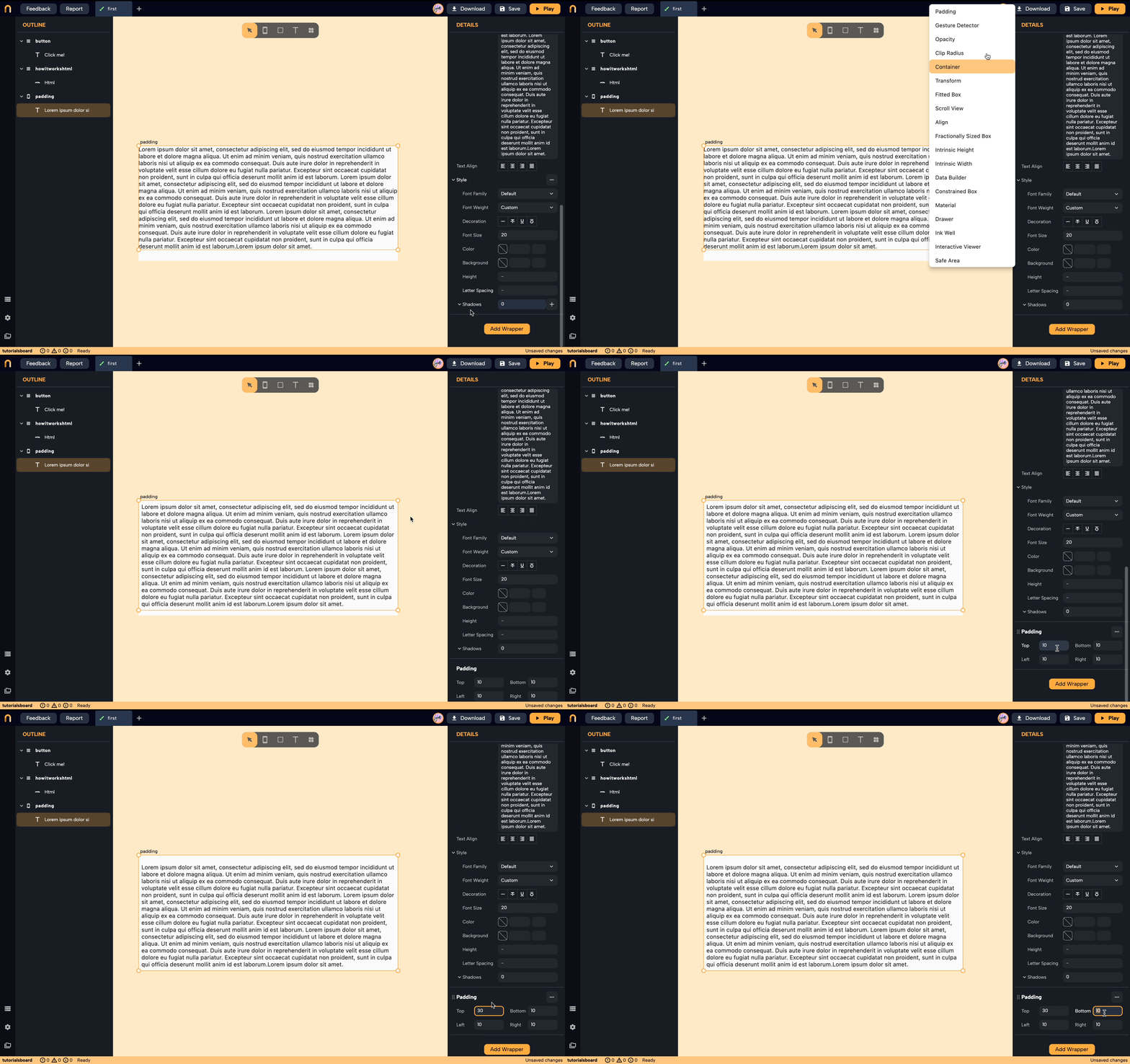
- Select the widget you want to add padding to.
- From the details panel, click on
Add Wrapperbutton, and selectPadding. - You can now modify the values of the padding in the details panel.

tip
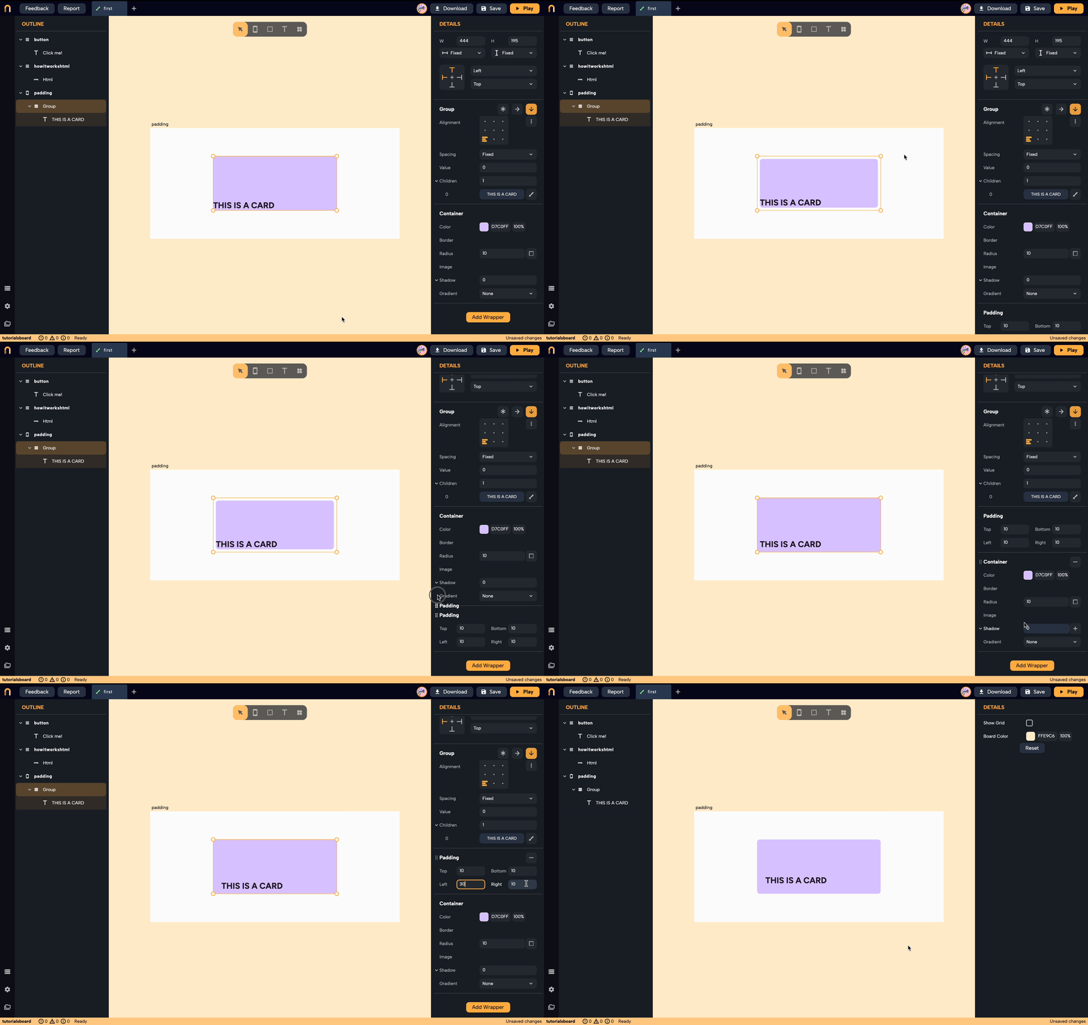
You can reorder the Padding Wrapper to make it inside or outside of a widget and change the effects and obtain the design that you want!
