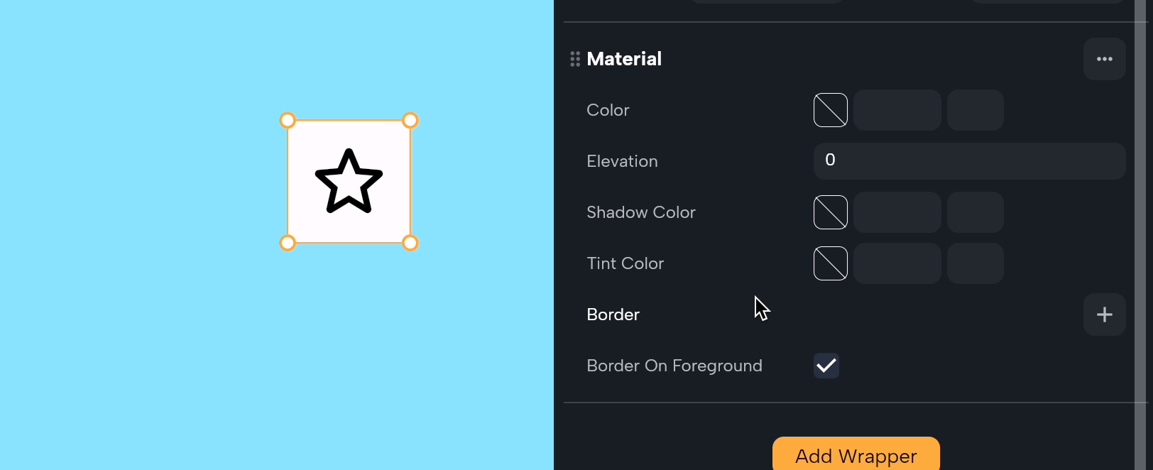
Material
The Material wrapper adds a physical layer to your app's UI, giving it depth and visual interest with properties like color and shadows. It's like adding a layer of paint and shadow to make certain parts stand out. Here's a simple breakdown of its properties:
Here are the properties of this wrapper:
-
Color: This is the background color of the material. Think of it as the paint you apply to this layer. You can choose any color to match your app's design.
-
Elevation: Elevation controls how high the material appears to be off the screen, which affects the size of the shadow it casts. A higher elevation makes the material look more lifted, creating a more pronounced shadow. It's like raising a piece of paper off a table—the higher it is, the bigger the shadow.
-
Shadow Color: This property lets you choose the color of the shadow that appears under the material. It's like picking what color the shadow is, making it lighter or darker depending on your design needs.
-
Tint Color: Tint color applies a color overlay on top of the material, changing its overall hue and appearance. It's like putting a colored filter over a photo.
-
Border: Borders define the outline of the material. You can customize the thickness, style, and color of the border to make the material stand out or fit in with your design.
-
Border on Foreground: This property decides if the border should be drawn over the material's contents (true) or under them (false). When true, the border appears on top of the material's color and shadow, making it more prominent.