Button
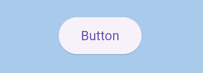
The Button widget lets users perform an action when pressed — such as navigating to another screen, submitting a form, or triggering logic.
Buttons can be styled, disabled, and connected to dynamic actions or data.
To add a Button, open the Widget Picker and search for Button.
📝 Text Inside the Button
Inside the details panel, you can modify the text properties of your button — including the label, font, and color.
For more details about text customization, check out the [[Text]] widget page.
⚙️ Button Properties
Here’s what you can control inside the Button widget:
- Enabled → Turns the button on or off. When disabled, the button becomes dimmed and non-interactive.
- On Pressed → Opens the Circuit editor to define what happens when the user taps or clicks the button.
- On Long Press → Opens the Circuit editor for actions triggered by pressing and holding the button.
- On Hover → Opens the Circuit editor for hover actions (useful for web and desktop).
- Button Style → Connects the button to a predefined or custom theme style, controlling its shape, background color, padding, borders, and more.
This property is directly linked to your app’s theme. Learn more in [[Themes]].
💡 Tip
Buttons are one of the most interactive elements in any app.
You can combine visual customization with logic to make them both beautiful and functional —
for example, changing colors dynamically based on state, or disabling a button until a form is complete.