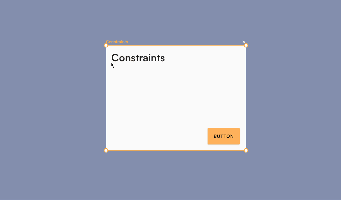
Constraints
Constraints define how widgets respond when the screen size changes.
They ensure your layout stays consistent across different devices and orientations — whether it's a phone, tablet, or desktop screen.
You can apply constraints on both the horizontal and vertical axes to control alignment and resizing behavior.

Horizontal Constraints
Horizontal constraints determine how a widget behaves along the X-axis.
- Left — Keeps the widget fixed relative to the left side of the screen.
- Right — Keeps the widget fixed relative to the right side of the screen.
- Left and Right — Anchors the widget to both sides, causing it to resize horizontally as the screen width changes.
Vertical Constraints
Vertical constraints determine how a widget behaves along the Y-axis.
- Top — Keeps the widget fixed relative to the top of the screen.
- Bottom — Keeps the widget fixed relative to the bottom of the screen.
- Top and Bottom — Anchors the widget to both sides, causing it to resize vertically as the screen height changes.
Center Constraint
Setting constraints to Center keeps your widget positioned relative to the center of the screen.
This is especially useful for elements that should stay perfectly centered, such as dialogs, icons, or logos.
If your layout looks off when resizing, double-check your constraints.
Mixing conflicting constraints (like “Left and Right” with “Center”) can cause unpredictable behavior.