Showing Snackbar
A Snackbar is a small, temporary message that appears at the bottom of the screen. It’s used to quickly notify users about a process, action, or event without interrupting their current interaction.
Here are a few real-life examples of when to use a Snackbar:
- When a user successfully deletes an item (e.g., "Item deleted")
- When an action fails (e.g., "Could not save the changes")
- To confirm an event (e.g., "Settings saved")
- To show quick feedback after pressing a button
It’s ideal for short, clear messages that don’t require user interaction.
How to Show a Simple Snackbar
To show a Snackbar in your app, follow these steps:
-
Open a function where you want to trigger the Snackbar. This could be:
- A function you created inside a screen or component
- An event handler that comes with a widget like a Button (
onTap,onPressed, etc.)
-
Click the small dot to add a new node in the function flow.
-
Go to
Globals > Show Snackbar. -
A Show Snackbar node will be added. By default, it includes a
Textwidget. -
Click on the brush icon next to the
Textwidget to edit it. -
In the popup, change the text to whatever message you want to display.
-
Play the screen to test the Snackbar in action.
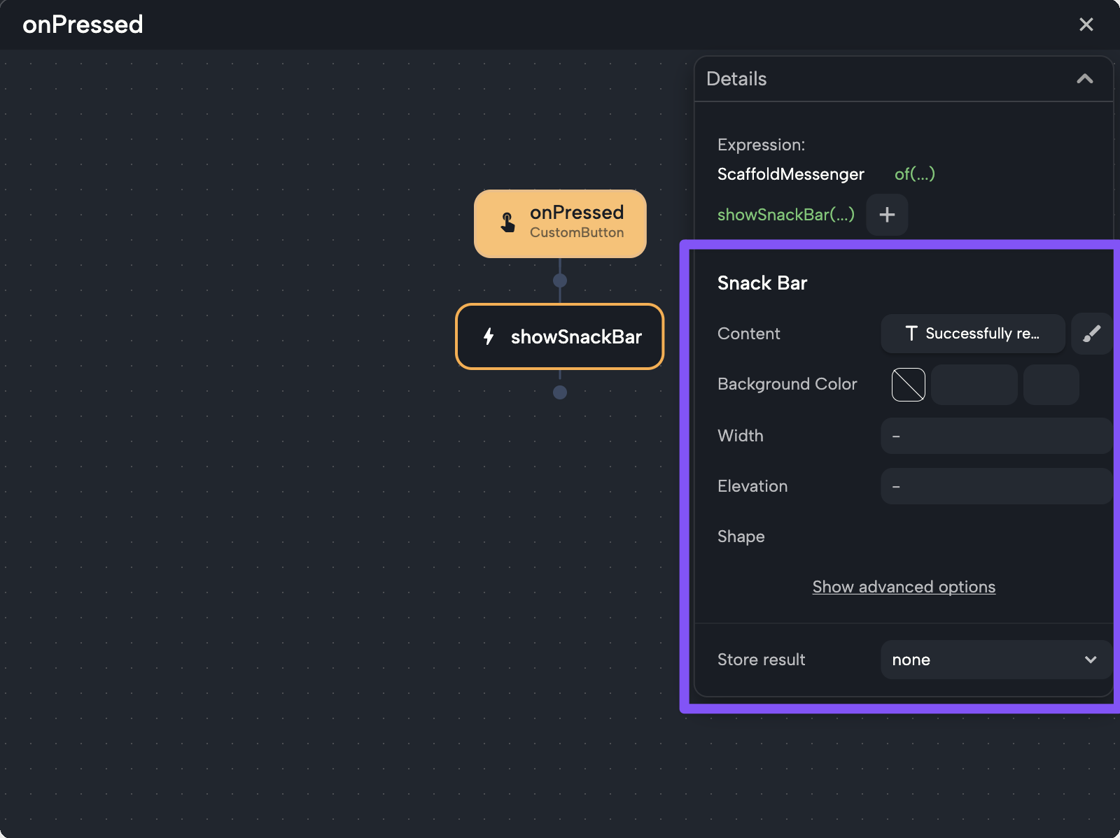
Properties of the Snackbar Node
When you select the showSnackbar node, you'll see the following properties:
-
Content:
The message shown in the Snackbar. It's aTextwidget by default, and you can edit it. -
Background Color:
Sets the background color of the Snackbar. -
Width (optional):
Lets you define how wide the Snackbar is. -
Elevation (optional):
Controls the shadow or depth. -
Shape (optional):
Defines the border radius and the overall shape of the Snackbar. -
Store result (optional):
You can optionally store a result returning from calling the Snackbar (a variable from type ofScaffoldFeatureController). You can then use that variable later to implement a callbackclosedto be called after the snackbar is closed.
You can right-click on any field and choose:
Set to Default: resets it to its original valueSet to Null: removes the value entirely
Dynamic Message
You can show dynamic content in the Snackbar by connecting the message to a variable, parameter, or function result.
To do this:
- Click on the text property of the
Textwidget inside the Snackbar node. - The linking menu will appear. You can:
- Connect it to a local variable or parameter
- Use a function call that returns a String
- Create a custom expression
Custom Expression Examples
You can mix static text and dynamic values using Dart expressions. Here are some examples:
"There’s an error: " + error"There’s an error: ${getError()}""Successfully added ${item.name}""Total is " + total.toString()"Online: ${isOnline.toString()}"
In the video above, we have a variable called item with a property name.
To show the message "successfully deleted iPhone", we:
- Clicked on the
Textproperty field of the Snackbar - Used a custom expression
- Typed:
"successfully deleted ${item.name}"
When we ran the app, the Snackbar showed the correct value.
If you're working with an integer, boolean, or other type, make sure to convert it to a string using .toString().
You can write directly in the text field and inject variables using:
$variableName${object.property}- Or open the linking menu with
$to choose what to inject
Examples:
"Saved: $filename""Deleted: ${item.name}"