Showing Dialogs
Dialogs are popups that show up in the middle of the screen, usually to give users some important message or ask them to make a choice.
You can use a dialog to:
-
Confirm actions (e.g., "Are you sure you want to delete this item?")
-
Show a warning or error
-
Ask the user for simple input (like a name)
-
Display custom content like terms and conditions or login prompts
Showing a Basic Dialog
To show a dialog in Nowa, follow these steps:
-
In your screen or component, find the function where you want the dialog to appear. For example, this can be the
OnPressedevent of a button, or a funciton you create inside a screen/component. -
Click on the small circule to add a node inside the function. The nodes menu will open.
-
Under the
Nowacategory, choose theshowDialognode. -
A default
AlertDialogwidget will be created as thebuilderof the dialog. This is the actual content that will be shown. -
Click on the
AlertDialogto replace it with another widget if needed or with a component that you built before. (It's recommended to use theAlertDialogwidget for dialogs. You can customize its UI as needed). -
Click the brush icon next to
AlertDialogto edit the widget UI. -
Inside the AlertDialog details panel, you can for example:
-
Change the title text
-
Edit the background color
-
Customize the buttons (actions)
-
-
For example, to change the title, click the brush next to
Title, then change the text to whatever you want. -
Now run the app. When you click the button, the dialog should appear with your custom text.
This videos shows how to show a simple dialog:
Understanding showDialog Properties
When you add the showDialog node in Nowa, you’ll see a panel of properties on the right. These let you control how the dialog behaves and looks. Let’s go through them one by one, as shown in the screenshot:
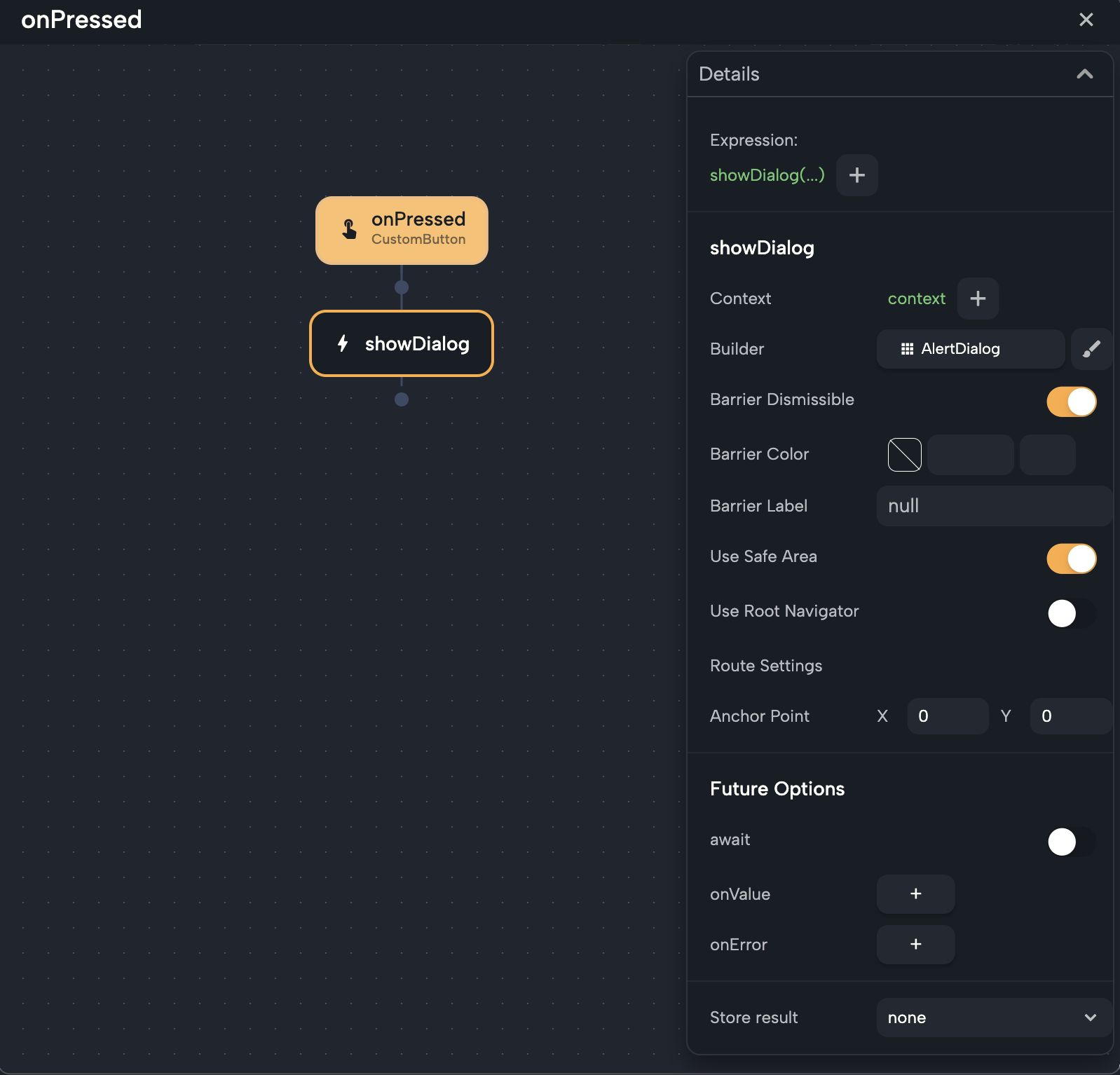
✅ Context
-
This is required to show any dialog. It tells the system where in the widget tree the dialog should appear.
-
It’s usually set automatically to the current screen or component.
Note: using showDialog should be inside a screen or component function or event.
🧱 Builder
-
This is the actual widget that will be displayed inside the dialog—by default, it’s an
AlertDialog. -
You can change it to any other widget by clicking on it then choosing
Pick widget. You can change it to another widget, or a custom component that you created before -
Click the brush icon next to it to customize the content inside the dialog.
🚪 Barrier Dismissible
-
If enabled, the dialog will close when the user taps outside of it.
-
Turn this off if you want the user to be forced to take an action (like confirming or cancelling).
🎨 Barrier Color
-
Sets the background color behind the dialog.
-
Usually a semi-transparent black is used to focus attention on the dialog.
🔤 Barrier Label
-
An optional label for accessibility purposes (e.g. screen readers).
-
You can leave this as
nullunless you want to customize the accessibility message.
🛟 Use Safe Area
-
If enabled, the dialog avoids system UI elements like notches, status bar, or bottom navigation.
-
It’s usually good to keep this on for a better layout on all devices.
🌐 Use Root Navigator
-
When set to true, the dialog uses the root-level navigator.
-
Useful in complex navigation setups like nested navigators or modals.
-
If you’re unsure, leave it off.
⚙️ Route Settings
-
This lets you define advanced routing options like the dialog’s name or arguments.
-
Not commonly used unless you have custom route behavior.
🎯 Anchor Point (X, Y)
-
This defines the position the dialog animates from.
-
By default, it's set to (0, 0), which means the center of the screen.
-
You usually won’t need to change this unless you're doing special animations.
🧪 Future Options
These control how to handle the result returned from the dialog:
⏳ Await
-
Enable this if you want to pause the current function and wait for the dialog to return a value.
-
Useful when you want to make decisions based on user input in the dialog.
🔁 OnValue
-
Instead of using
await, you can useonValueto create a function that runs when the dialog returns a result. -
This is helpful for running logic after the dialog closes without pausing the rest of your function.
-
Inside this function, you get a
valuevariable, which is what the dialog returned.
⚠️ OnError
-
If something goes wrong when opening the dialog (very rare), this function will run.
-
You can use it to show an error message or log the issue.
📥 Store Result
-
When
awaitis enabled, you can choose a variable to store the result returned from the dialog. -
This result can be a string, number, boolean, or anything returned using
Navigator.pop()inside the dialog.
These options give you full control over both the design and behavior of your dialogs. Whether you're confirming an action, customizing animations, or handling returned data—Nowa's visual dialog system makes it easy to implement.
Designing Your Own Custom AlertDialog
Instead of customizing the UI of the AlertDialog inside the Circuit, you can drop AlertDialog widget on the board, customize it's UI, make a component out of it, then use that component as the builder for showDialog.
This makes it possible to reuse the same component you designed in different nodes where you are showing a dialog.
To do so:
-
Drop an AlertDialog widget on your board and design it however you like—add icons, images, texts, buttons, etc.
-
Once you’re happy with it, turn it into a component.
-
Go back to the
showDialognode, and change thebuilderto use your newly created component.
Now when the dialog is shown, it will use your custom design instead of the default.
Returning Data from Dialog
You can return a value from a dialog—just like using Pop for Navigator node. Click here to read more about using the Navigator node
Here's how it works in Nowa:
Using await
-
In the
showDialognode, clickawaitto wait for the dialog to return a result. -
Choose
store resultand create a variable to hold the returned value. -
Pick a data type (e.g.,
String) based on what you expect the dialog to return.
Inside the dialog:
-
Add a button as part of the
actions. -
In the button’s action, add a
Navigatornode with typepop. -
Choose the result type and set the result value you want to return (e.g., a text input, a choice made, or even a static string).
Now the result is stored in the variable you created and can be used later in your function.
To see more about that, check using Pop inside Navigator node
Using OnValue
If you don’t want to use await, you can create an OnValue function instead:
-
Add a new function and set it as
OnValuefor the dialog. -
Inside the function, you’ll see a
valueparameter. -
This
valueholds whatever was returned from the dialog. Use it directly within the function.
This method is useful when you want to avoid stopping your function while waiting for the dialog to return.
That’s it! Now you know how to show dialogs in Nowa, customize them, and even get data back from them—everything you need to create polished user experiences.