Actual Prompts Used to Build Full Apps
Welcome!
In this page, you’ll see real examples of how to use Nowa’s AI prompts to create Flutter app screens.
Think of these as ready-to-use recipes — you can copy, adjust, and make them your own.
Each example shows you:
- The prompt that was given to the AI.
- The design guidelines to keep in mind.
- The result that Nowa produced.
By the end, you’ll see how powerful simple text prompts can be in shaping your app.
Example 1: Mobile Profile Screen UI
What we asked for:
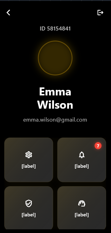
A mobile profile screen.
Header Section
At the top, the profile screen includes:
- User’s ID
- Profile picture
- Full name
- Email address
- A dark background with a light accent
Button Grid (2x3)
Below the header, six buttons are arranged in a grid.
Each one is a rounded square with soft shadows, an icon, and a label.
- Settings
- Notifications (with a red badge showing a count, e.g., 7)
- Verification
- Support
- Referral
- Legal
Design Guidelines
To achieve the right look and feel:
- Keep the layout simple and easy to follow
- Use clear and bold text
- Center the content
- Make the grid clean and structured
The Full Prompt
Design a mobile profile screen UI. At the top, display the user's ID, profile picture, full name, and email address on a dark background. Below, arrange six rounded square buttons in a 2x3 grid with soft shadows. Each button should have an icon and label:
Settings
Notifications (with a red badge showing unread count, e.g., 7)
Verification
Support
Referral
Legal
Keep the design simple, with a dark background and clear, bold text. The layout should be easy to use and centered.
Result

Example 2: Mobile Stopwatch App UI
What we asked for:
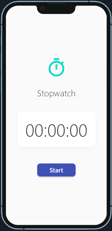
A stopwatch app screen.
Main Interface
The main screen shows:
- A title: "Stopwatch"
- A large, clear timer display in
00:00:00format - A blue "Start" button with rounded corners
- A light background for clarity
Core Features
- A turquoise stopwatch icon at the top
- Easy-to-read digital time display (monospace font)
- A large, finger-friendly action button
Design Guidelines
To keep the stopwatch clear and useful:
- Keep the design minimal, with only the stopwatch features
- Use high contrast (dark text on light background) for readability
- Place the button where it’s easy to tap
- Use modern, legible text
The Full Prompt
Create a clean and simple mobile stopwatch app interface. Display "Stopwatch" as the title at the top with a turquoise stopwatch icon. Show the time in large, clear digits as "00:00:00" in the center. Below that, place a blue "Start" button with rounded corners. Use a white background with modern, legible text. Focus only on the stopwatch functionality with high readability and mobile-friendly button sizing.
Result
